Apotek Titokita
Pharmacy Rebrand & Signage System
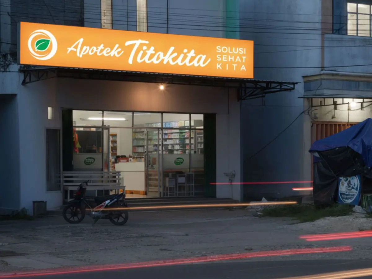
A local pharmacy in Lampung asked for more than a logo. Apotek Titokita wanted to look as trusted and modern as the national pharmacy chains — without losing the warmth of being a neighborhood store. The brief: design a complete identity system that worked from the street to the shelf, on a small-business budget, using only locally-available fabrication.
The Challenge
In Indonesia's pharmacy sector, trust is the product. Customers expect clinical authority but stay for human connection. The previous identity was communicating neither. The new system had to deliver both — and extend cleanly across logo, outdoor signage, indoor signage, and in-store communication.
The Approach
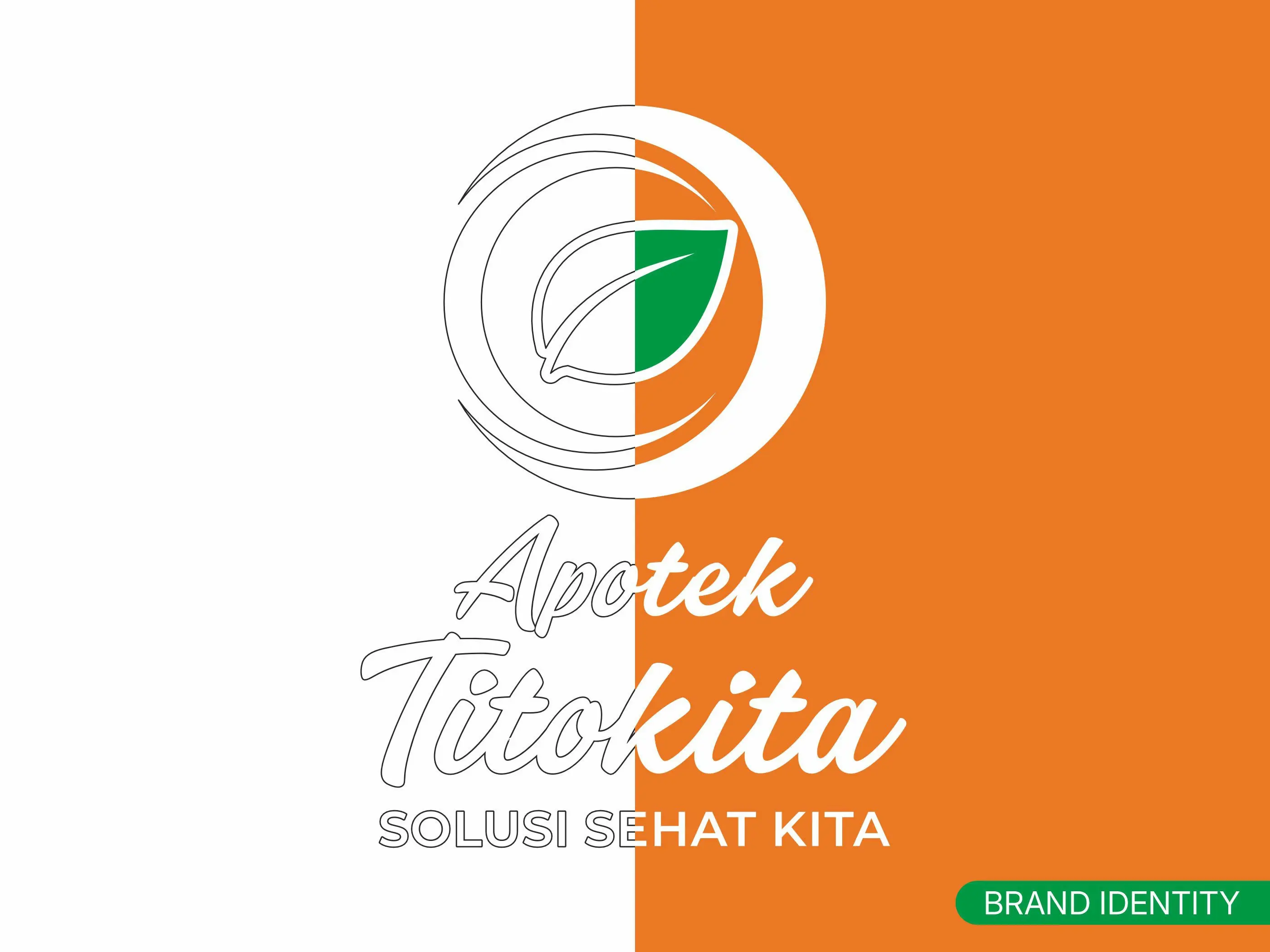
"Solusi Sehat Kita" — Our Healthy Solution — positions the pharmacy as a community partner, not a retailer. The leaf icon brings the wellness category instantly. Script typography adds human warmth. The orange + white + green system was chosen for high-contrast street visibility, easy print reproduction, and recognition at speed — whether a customer is driving past at night or walking up at noon.
From Concept to Confidence — Before Fabrication
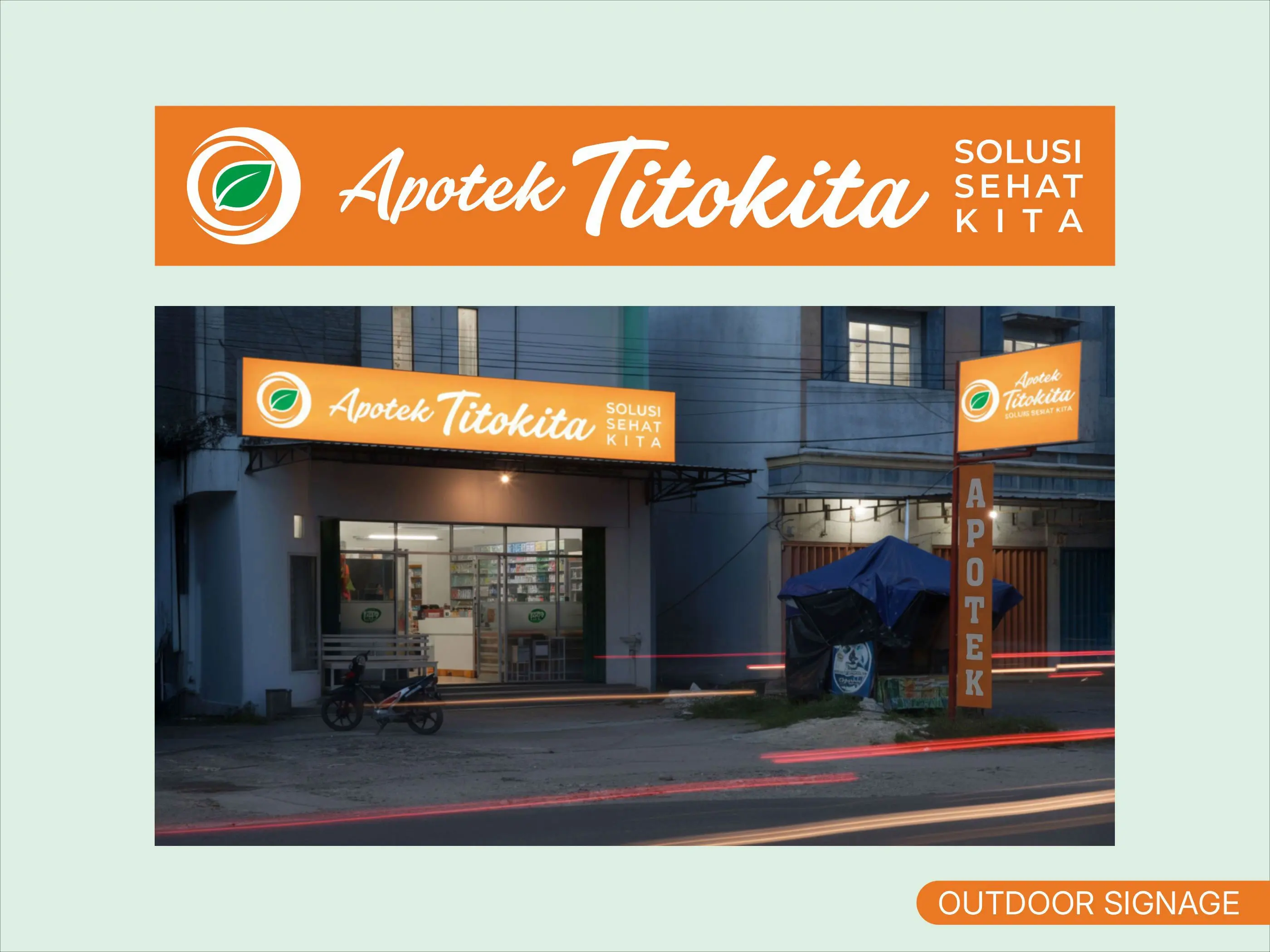
Before any sign went into production, I generated photorealistic AI visualizations placing the proposed identity onto the actual storefront and store interior. This pre-build step lets the client see exactly how the brand will live in real-world context — building confidence, reducing fabrication risk, and surfacing details that only become obvious when you see the brand in situ. It's the AI-accelerated workflow I bring to every brand project: 80% AI-powered exploration, 20% senior judgment on the final cut.
The Outcome
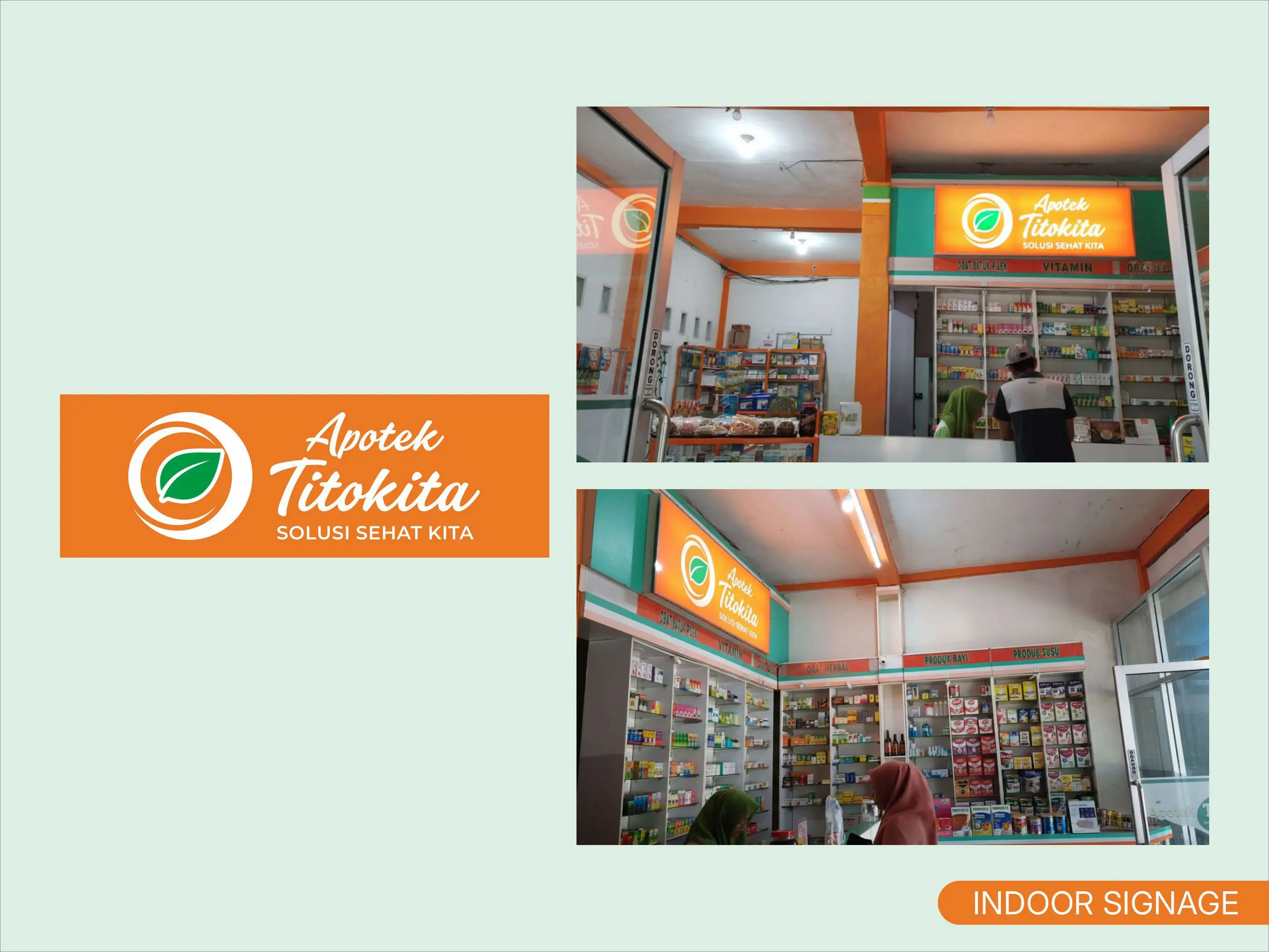
Apotek Titokita now has a complete, scalable brand system. The identity extends naturally to packaging, uniforms, and additional store locations without further design work — exactly what a small business needs from a one-time rebrand investment, and exactly what agencies need when rolling out brand systems for their clients.
Project Details
- Tools: CorelDRAW, Adobe Photoshop, Adobe Firefly (AI visualization)
- Deliverables: Logo, brand mark, outdoor signage system, indoor signage system, brand color and typography guidelines, photorealistic pre-build visualizations
- Client: Apotek Titokita — independent pharmacy in Lampung, Indonesia