I Gave Seedream 5.0 Pro 4 "Breakthrough" Claims to Prove. It Only Survived 3.
ByteDance launched Seedream 5.0 Pro on July 8, 2026, positioning it as a direct challenger to GPT Image 2 and Nano Banana Pro. The pitch: four core breakthroughs — complex information visualization, interactive precision editing, realistic imagery, and native multilingual text rendering.
I don't take marketing claims at face value. So I ran a structured field test on all four, using ImagineArt as the access point. Here's what actually held up, and what didn't.
Complex Information Visualization
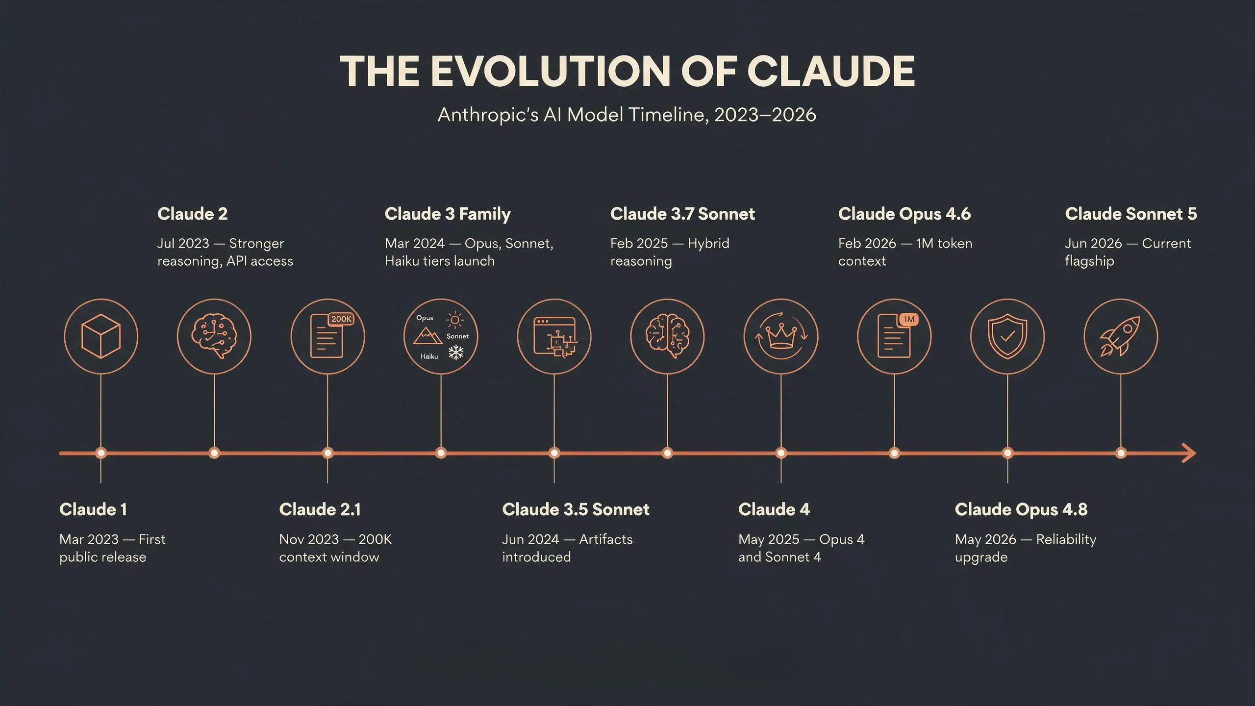
Test 1 — Pure Recall. I asked for a fully-specified infographic: the evolution of Claude, 10 model generations, dates and descriptions all provided by me. Zero errors. Every name, every date, every description landed exactly as written. It even inferred a mountain/sun/snowflake visual metaphor for the Opus/Sonnet/Haiku tier split — unprompted.
The prompt:
Horizontal 16:9 infographic titled "THE EVOLUTION OF CLAUDE" at the top in bold modern sans-serif, subtitle "Anthropic's AI Model Timeline, 2023–2026". Layout: a single horizontal timeline spine running left to right across the center of the frame, with 10 evenly spaced nodes/dots along it. Each node has a small circular icon above and a text label block below connected by a thin vertical line. Alternate label blocks above and below the spine to avoid crowding. The 10 nodes in order, left to right, each with a bold title and one short line of description beneath:
- "Claude 1" — "Mar 2023 — First public release"
- "Claude 2" — "Jul 2023 — Stronger reasoning, API access"
- "Claude 2.1" — "Nov 2023 — 200K context window"
- "Claude 3 Family" — "Mar 2024 — Opus, Sonnet, Haiku tiers launch"
- "Claude 3.5 Sonnet" — "Jun 2024 — Artifacts introduced"
- "Claude 3.7 Sonnet" — "Feb 2025 — Hybrid reasoning"
- "Claude 4" — "May 2025 — Opus 4 and Sonnet 4"
- "Claude Opus 4.6" — "Feb 2026 — 1M token context"
- "Claude Opus 4.8" — "May 2026 — Reliability upgrade"
- "Claude Sonnet 5" — "Jun 2026 — Current flagship"
Color palette: deep charcoal navy background, warm terracotta-orange accent line for the timeline spine (matching Anthropic's brand color), cream-white text, minimal flat vector icons (no photorealism). Clean modern tech-editorial layout, generous white space, structured grid, legible small text, professional data-visualization style, no decorative clutter.
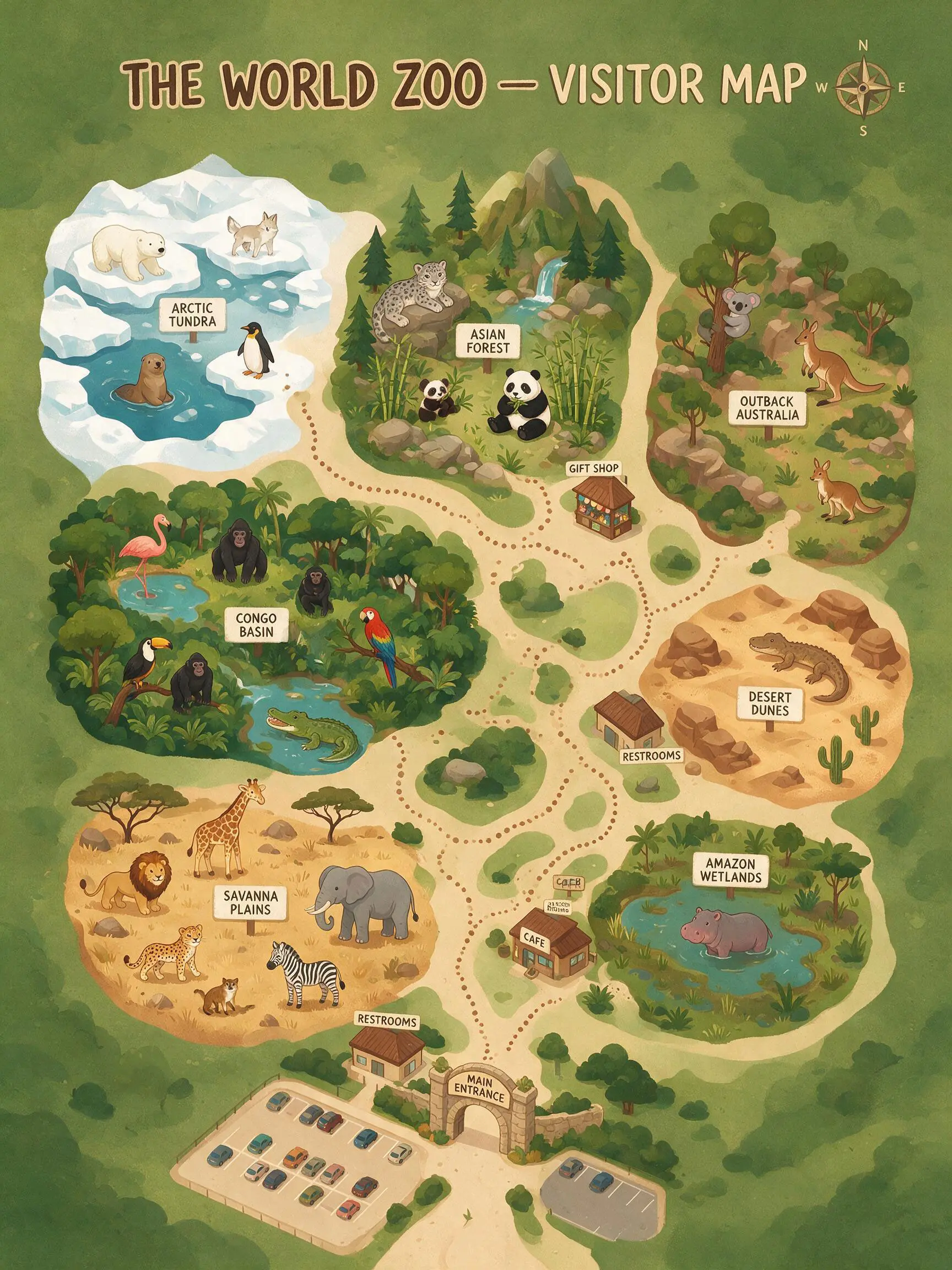
Test 2 — Creative Reasoning. I flipped the test: gave it 24 animals and asked it to be its own zoo architect — cluster by habitat, invent zone names, design a non-crossing path, prioritize popular animals near the entrance. It correctly grouped polar bear + penguin + arctic fox by climate, invented coherent zone names from scratch, and built a genuinely sensible path. But it silently dropped 5 of 24 animals (~20%) and made two habitat-logic errors — a hippo in "Amazon Wetlands" and a duplicated crocodile.
The prompt:
Illustrated top-down bird's-eye visitor map for a fictional zoo called "THE WORLD ZOO", vertical 3:4 layout, cartoon flat-illustration style. You are the zoo's architect: design a logical, navigable layout from scratch. Group these animals into sensible themed zones based on their natural habitats, and invent an appropriate zone name for each group. Design a single main walking path from the entrance that visits every zone without crossing itself, plus small side loops if needed. Place zones so that animals needing similar climate or habitat are near each other, and position larger/more popular animals for easy early access from the entrance.
Animals to include: lion, giraffe, zebra, elephant, gorilla, chimpanzee, red panda, giant panda, snow leopard, polar bear, arctic fox, penguin, sea lion, koala, kangaroo, wallaby, flamingo, macaw, toucan, crocodile, komodo dragon, meerkat, cheetah, hippopotamus.
Include a main entrance at the bottom of the map, a compass rose, restrooms, a cafe, and a gift shop placed sensibly along the path. Title the map "THE WORLD ZOO — VISITOR MAP" in bold playful lettering at the top. Style: warm earthy color palette, clear zone boundaries, clean legible labels, dotted trail line, friendly family-park aesthetic. Keep all text short, legible, and spelled correctly.
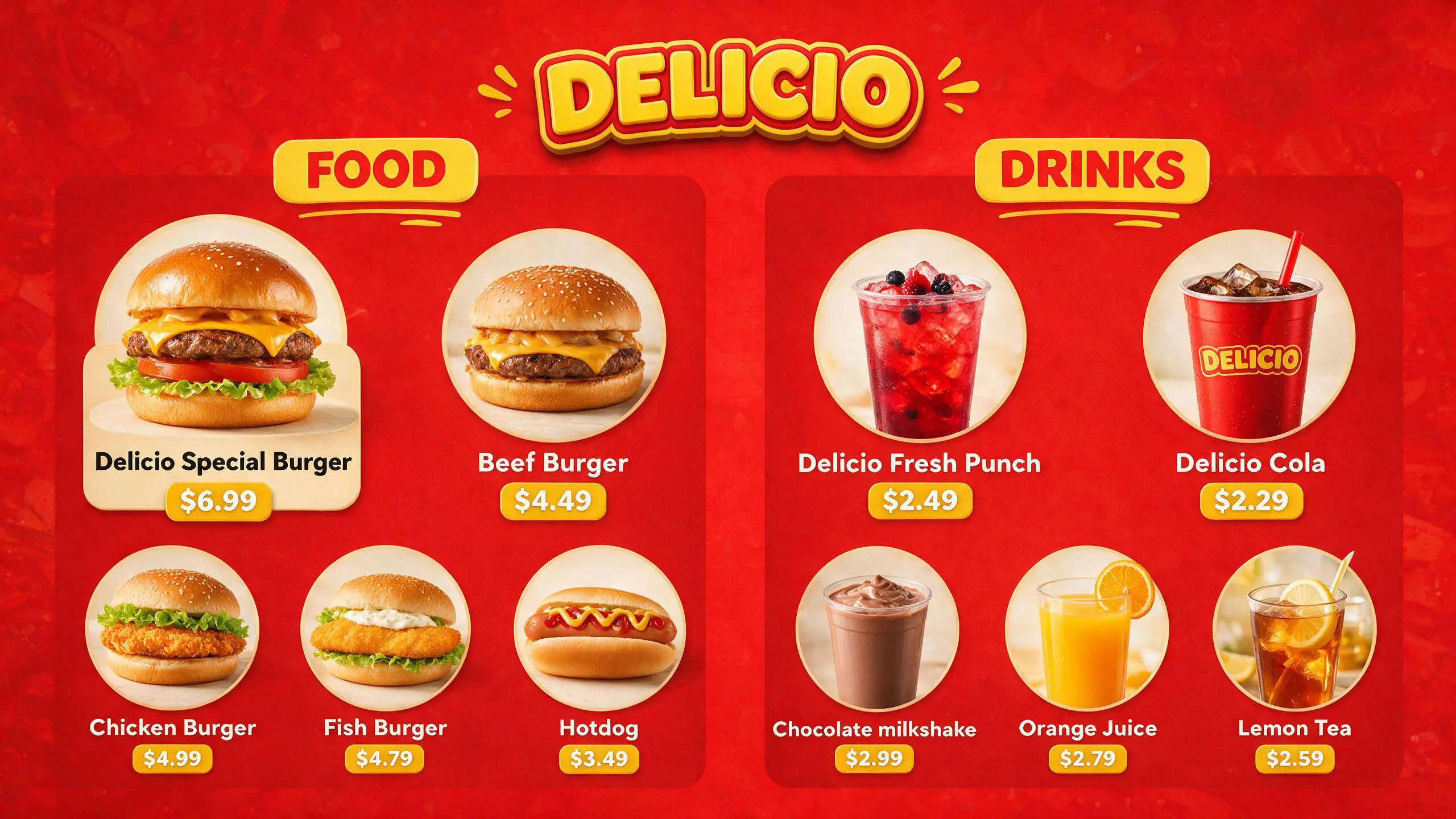
Test 3 — Dense Structured Facts + Photography Combined. A 10-item fast food menu board, every name and price fully specified. 10/10 prices correct, zero digit errors, zero garbled text — the exact failure mode that plagues most AI tools with small critical text.
The prompt:
A professional fast food restaurant menu board for the brand "DELICIO", horizontal 16:9 layout, designed for an overhead digital menu display. Bold red and yellow color scheme, clean modern fast-food branding, "DELICIO" logo in bold rounded lettering at the top center. Layout divided into two clearly labeled sections side by side: "FOOD" on the left, "DRINKS" on the right. Each menu item shown as an individual card with a photorealistic, appetizing product photo on a plain white or light gray circular backdrop, the item name in bold below the photo, and the price in a colored price tag beneath the name.
FOOD section, 5 items in a grid:
- Photorealistic burger with a golden bun, stacked patty, cheese, lettuce, tomato — "Delicio Special Burger" — $6.99
- Classic beef burger with sesame bun — "Beef Burger" — $4.49
- Crispy chicken burger with lettuce — "Chicken Burger" — $4.99
- Golden breaded fish burger with tartar sauce — "Fish Burger" — $4.79
- Classic hotdog with mustard and ketchup in a soft bun — "Hotdog" — $3.49
DRINKS section, 5 items in a grid:
- Red fruit punch in a clear cup with ice — "Delicio Fresh Punch" — $2.49
- Cola in a branded red cup with ice and straw — "Delicio Cola" — $2.29
- Chocolate milkshake in a clear cup — "Chocolate" — $2.99
- Fresh orange juice in a clear cup — "Orange Juice" — $2.79
- Iced lemon tea with lemon slice garnish — "Lemon Tea" — $2.59
Style: bright studio food photography lighting, sharp focus, commercial advertising quality, consistent circular photo frames, clean grid alignment, legible sans-serif pricing, no clutter, professional QSR menu board aesthetic. All text must be spelled correctly and prices clearly legible.
Verdict: Seedream is excellent when every fact is explicitly given — it lays things out cleanly with near-perfect accuracy. It's noticeably shakier the moment it has to exercise judgment or fill gaps itself, and it doesn't flag that uncertainty. Silent omission is arguably more dangerous for production work than an obvious failure would be.
Interactive Precision Editing (Layer Separation)
This is where the marketing outpaced the product — at least on ImagineArt's current implementation.
A single-prompt request to separate a finished image into layers, exactly as ByteDance's own demo describes, returned the source image completely unchanged. No error, no separation — just the same file back.
Verdict: Could not verify this feature as functional through this access path. This may be a UI/access limitation rather than a model limitation — it would need retesting via Dreamina or the raw API before drawing conclusions about the underlying model.
My honest suggestion to ImagineArt: this feature needs a dedicated interface, not a text-prompt workaround. A real layer-export panel — where a single request returns multiple distinct, properly aligned image outputs (background, text, subject, etc.) that a user can preview and download individually — would make this capability genuinely usable for production design work. Right now, there's no clear path in the current UI for a creator to actually receive and use separated layers, even if the underlying model supports it.
Realistic Imagery & Portrait Textures
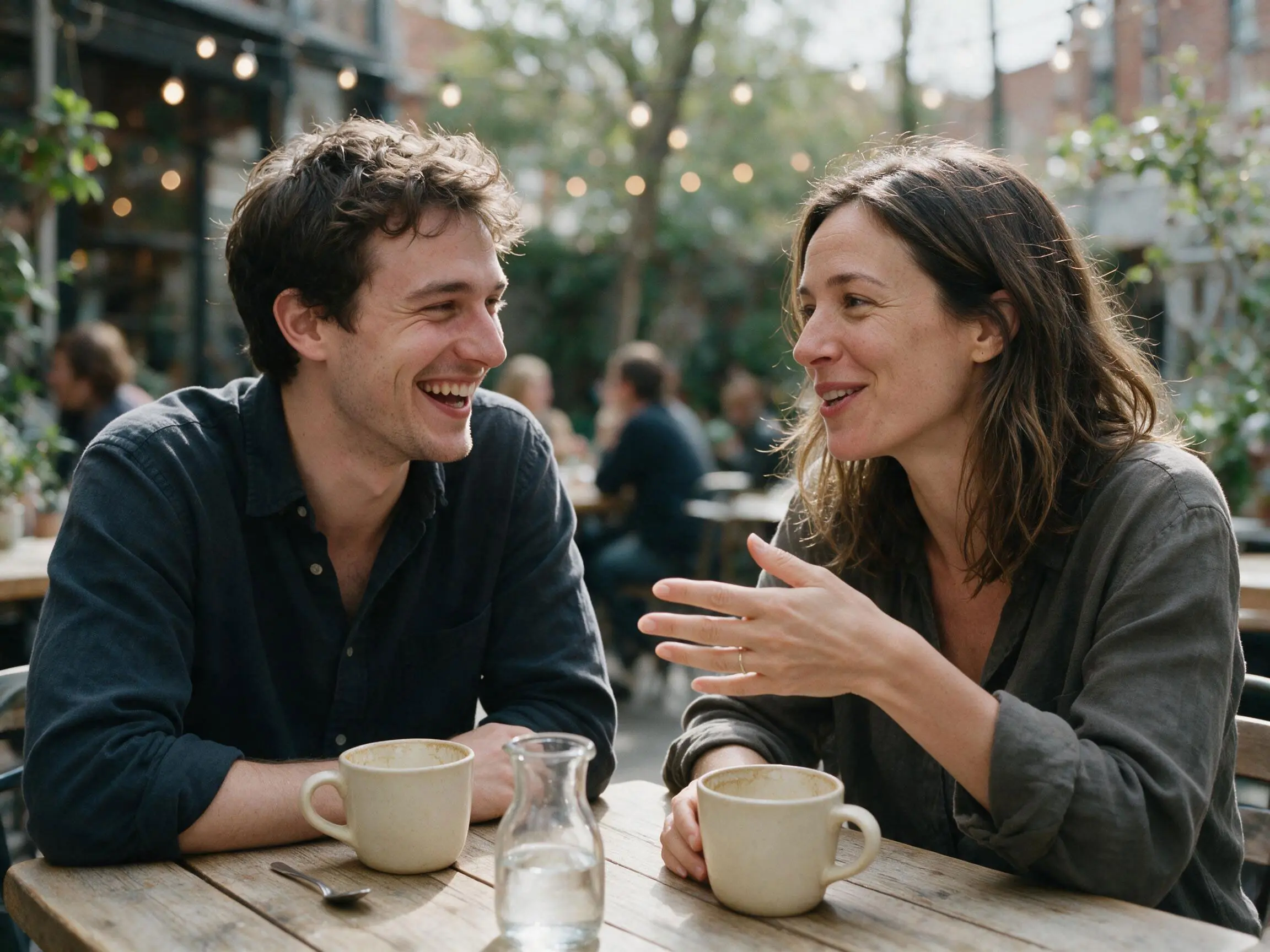
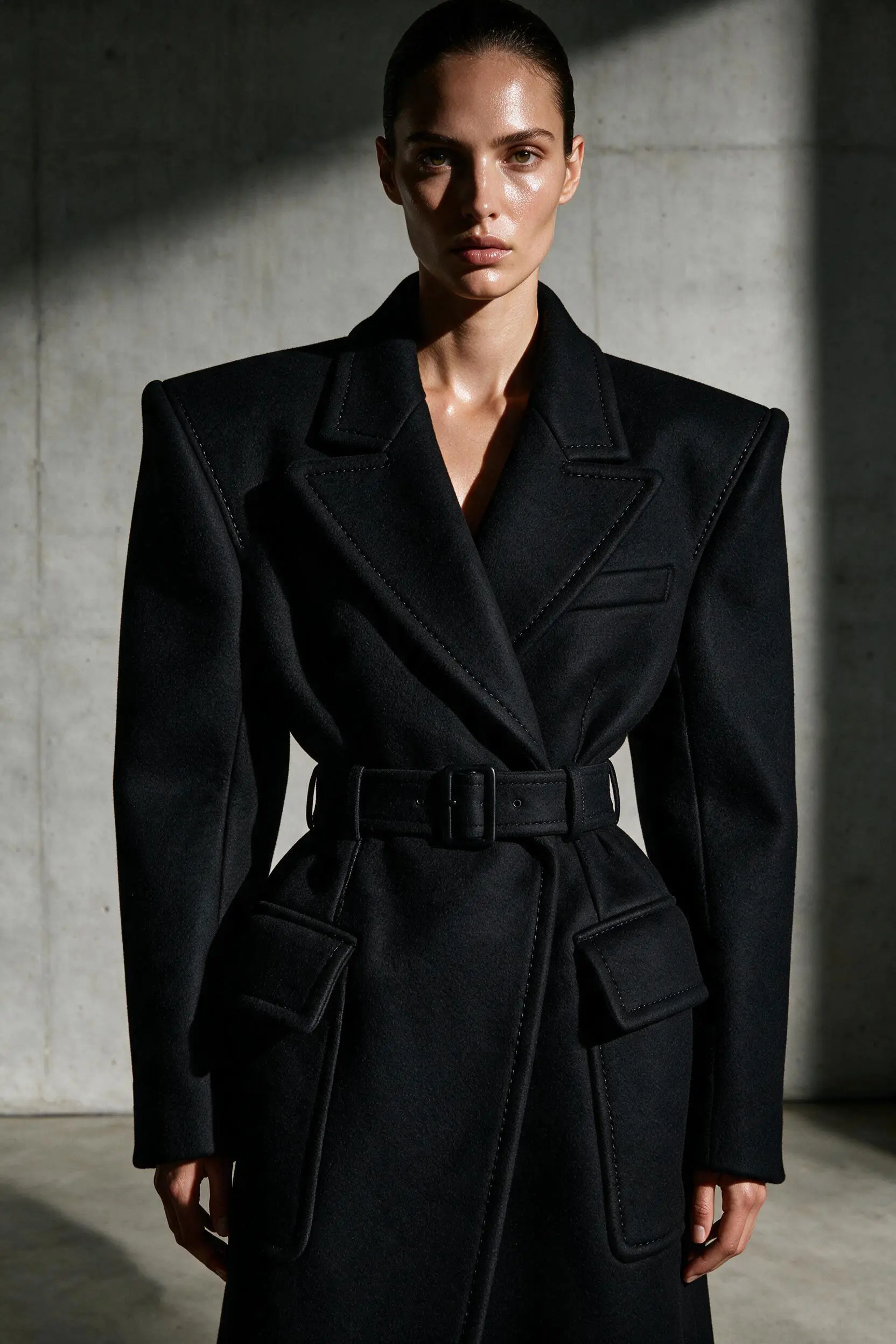
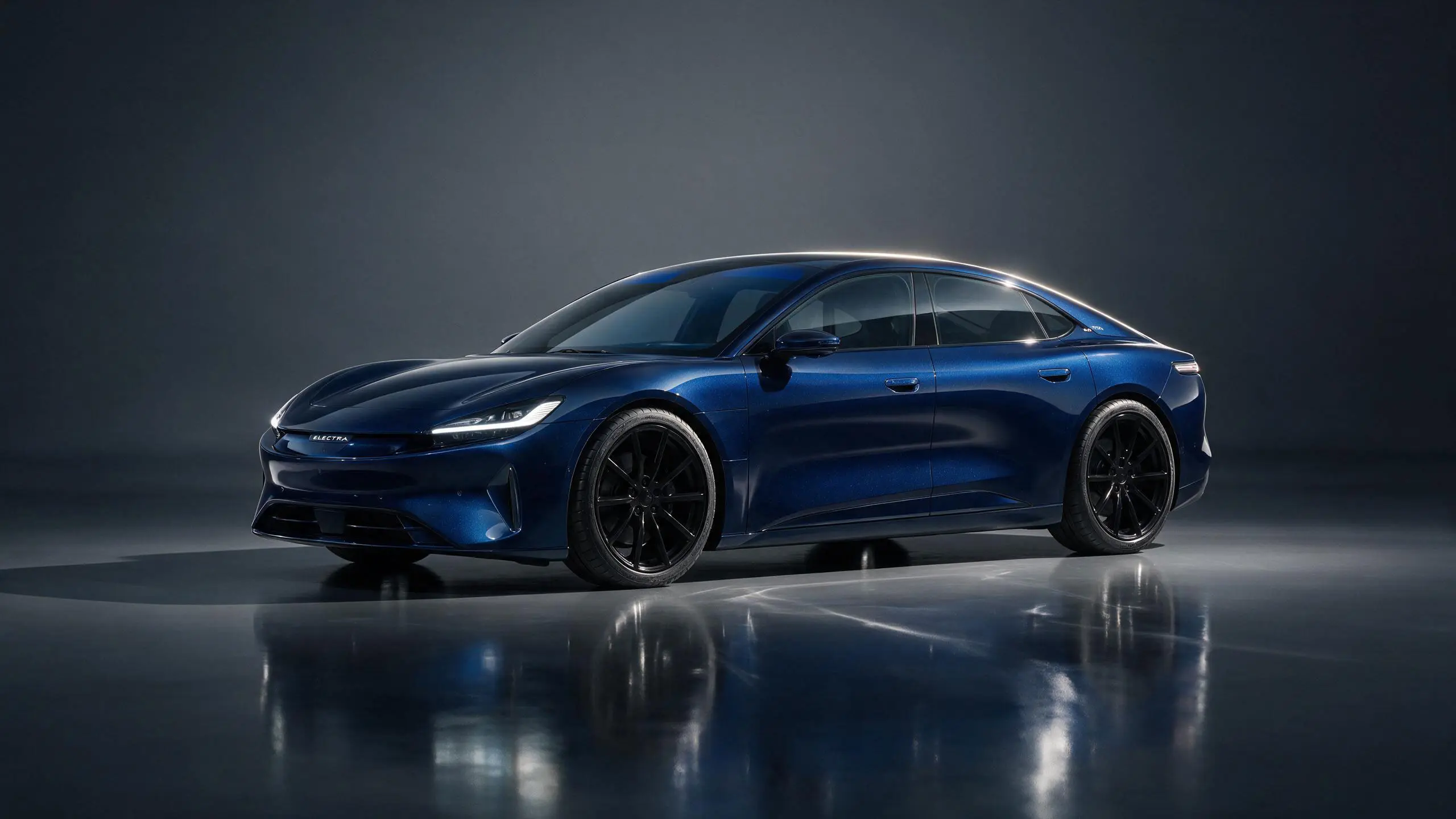
I ran three genres: a candid two-person photo, high-fashion editorial, and automotive product photography (a fictional electric sports car brand, "ELECTRA").
Skin texture, fabric drape, and paint reflections all held up convincingly — real pores, real fabric weave and stitching on a wool coat, real floor reflections following the car's silhouette and color. This is a genuine step up from the plastic-skin, waxy-fabric tell that gave away most AI images a generation ago.
The prompt:
Candid photorealistic photo of a man in his late 20s and a woman in his mid-30s, sitting together at an outdoor café table, caught mid-conversation in a natural unposed moment. He is laughing naturally, looking at her; she is smiling and gesturing with her hand while speaking, both slightly off-camera, not looking at the lens. Soft overcast daylight, gentle diffused shadows falling consistently across both subjects, visible realistic skin texture on both including subtle pores and natural skin tone variation, natural makeup-free skin, realistic hair flyaways catching the light. Shot on a 50mm lens, shallow depth of field, background softly blurred with warm bokeh from string lights and other café patrons out of focus. Candid photojournalism style, not posed, natural imperfect framing, documentary feel, true-to-life color grading, no beautification or airbrushing.
The prompt:
High-fashion editorial photograph, female model in an avant-garde structured black wool coat with sharp architectural shoulders, standing against a minimalist concrete studio backdrop. Dramatic single-source side lighting creating deep controlled shadows across the face, sharp contouring, glossy skin with realistic light reflection, intense direct gaze at camera. Shot on medium format, ultra-sharp focus on fabric texture and skin detail, high-contrast editorial color grading reminiscent of Vogue or Harper's Bazaar, professional studio fashion photography style.
The prompt:
Professional automotive product photograph of a sleek electric sports car by the brand "ELECTRA", low and aerodynamic silhouette, glossy deep metallic blue paint finish, positioned three-quarter front angle in a minimalist studio setting. Reflective dark gray studio floor with a soft mirror-like reflection of the car beneath it, seamless dark gradient backdrop. Dramatic single-source studio lighting from the upper left creating realistic specular highlights along the car's body lines, sharp crisp reflections on the glass windshield and glossy paintwork, subtle rim lighting along the roofline separating the car from the background. Small "ELECTRA" badge logo visible on the front grille area and rear panel, correctly spelled. Sharp focus on the entire vehicle, realistic tire and rim detail, commercial automotive advertising photography style, ultra high-end, no props, clean composition, color-accurate.
Native Multilingual Text Rendering
This is where the testing got genuinely interesting.
Original Image
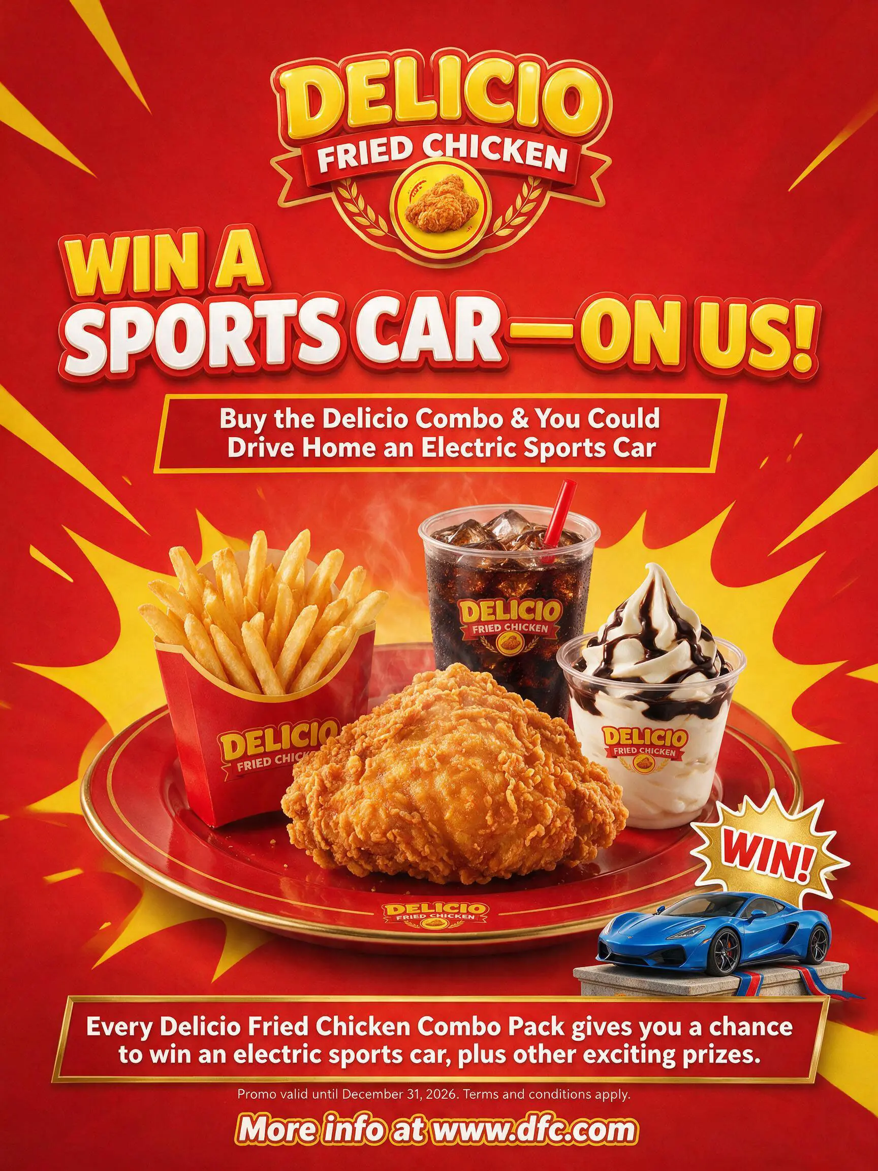
Chinese localization was close to flawless — natural, correctly localized copy (not literal word-for-word translation), a smart phonetic transliteration of the invented brand name, and even a full logo re-render matching the original's embossed badge styling.
The prompt to edit original image:
Using this fast food promotional poster as reference, recreate the exact same design, layout, food photography, car visual, and color scheme, but translate all text content into Simplified Chinese. Keep the same composition and visual elements — only change the language of the text.
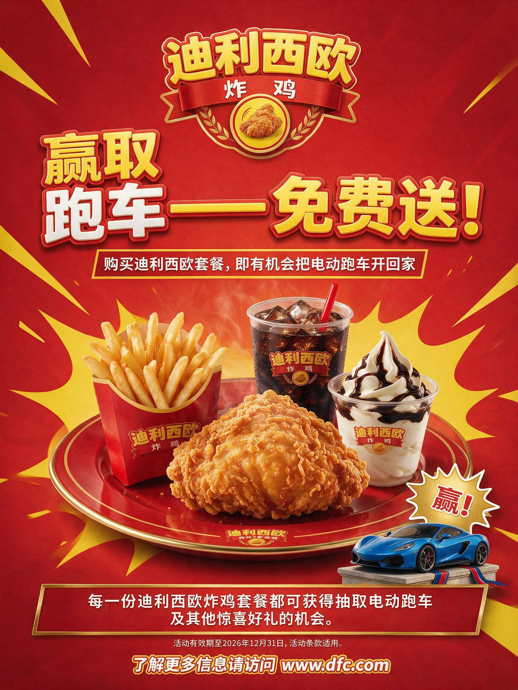
Arabic localization told a more complex story. First attempt: correct RTL script and grammar, but the stylized logo and "WIN!" badge stayed untranslated in English — while the same test on Chinese fully committed.
The prompt to edit original image:
Using this fast food promotional poster as reference, recreate the exact same design, layout, food photography, car visual, and color scheme, but translate all text content into Arabic with correct right-to-left text alignment and typography. Keep the same composition and visual elements — only change the language of the text.
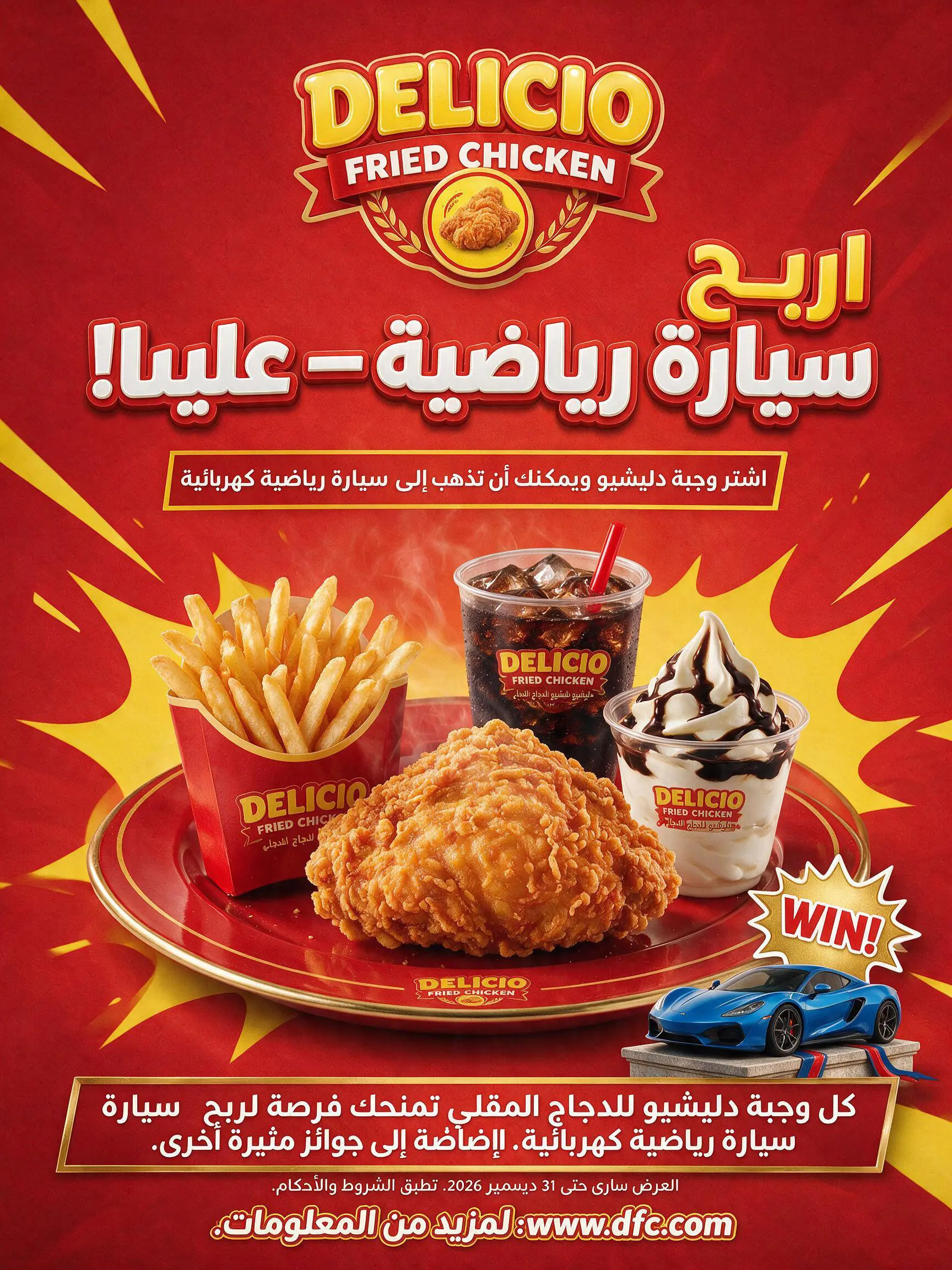
Verdict: The model can execute each individual localization constraint correctly. What it struggles with is holding multiple hard constraints simultaneously in one generation — fix one, and another quietly regresses. Real-world takeaway: expect to iterate, and don't assume a single "translate everything" prompt will catch every element uniformly, especially stylized logo text.
The Bottom Line
Seedream 5.0 Pro delivers real, meaningful capability — not just marketing gloss. Dense factual layouts, photorealistic skin and material rendering, and multilingual text generation are all genuinely strong when you give the model fully-specified instructions.
But the pattern across all four features is consistent: it's a precise executor, not yet a reliable reasoner. Give it complete information and it delivers with near-zero error. Ask it to infer, judge, prioritize, or hold multiple constraints at once, and it starts making silent, confidently-presented mistakes — dropped items, regressed constraints, inconsistent defaults — with no flag that anything went wrong.
For creative directors: this is a tool worth having in the stack, but "generate and ship" is not the workflow. "Generate, verify every claim against your brief, iterate" is.
What's been your experience stress-testing Seedream 5.0 Pro — or any of the new wave of "reasoning" image models? Have you found the same gap between execution and judgment, or has a different tool surprised you? I'd love to hear what you're seeing in your own workflow — drop a comment or DM me, let's compare notes.