Google Says Nano Banana 2.1 Beats Its Previous Models. I Tested It Against Pro in 6 Use Cases.
What Google Claimed, and What I Found
Google released Nano Banana 2.1 on October 6, 2026, and said it "outperforms our previous models across the board," with notable leaps in visual design, mask-based editing, and subject consistency. Google's API pricing page adds improved visual quality, multi-turn character consistency and accurate text rendering. Google's own preference tests put 2.1 ahead of Nano Banana Pro, including on infographic design, and launch reports list aspect ratios up to 8:1.
I wanted to know which of those claims hold up when a creative director actually puts the model to work. So I ran seven tests across six use cases, the same prompt on Nano Banana 2.1 and Nano Banana Pro, and judged every output with my own eyes.
The short version: the claims held for structured graphic work. Visual design and infographics were where 2.1 delivered, and the 8:1 panorama format is real. For subject consistency and photographic quality, the results were split, with each model getting different details right. "Across the board" is not what I saw.
Every prompt and every image is below, so you can check my observations and judge for yourself.
How I Tested
This report tests whether Nano Banana 2.1 delivers Google's claimed strengths, using Nano Banana Pro, Google's premium image model, as the benchmark. Google's own tests rank 2.1 above Pro, so Pro is a fair yardstick.
- Platform: ImagineArt, default settings. ImagineArt does not expose 2.1's thinking-level control.
- One generation per model, per test. What you see is the first output. No rerolls, no cherry-picking.
- Same prompt for both models, written to target a specific claim. Every prompt is published in full.
- Resolution: 4K, except Test 1, which ran at 2K.
- Aspect ratio: identical for both models, except Test 4 (explained there).
- No scores. I report what I observed. The images are here so you can score them yourself.
Each verdict uses one of four labels: supported, not supported, inconclusive, or untested.
Test 1: Visual Design (Exhibition Poster)
2.1 executed the craft more cleanly; Pro followed the compositional direction more closely.
Claim tested: leap in visual design.
Prompt:
A print-ready exhibition poster for a fictional AI art exhibition called "LATENT SPACE", held in New York. Swiss International Typographic Style with a modern editorial edge. Portrait 2:3 format.
Layout: a strict 12-column grid with generous margins. The title "LATENT SPACE" set large in a bold grotesque sans-serif, flush left, occupying the top third, with tight leading and slight negative tracking. Below it, a single bold visual: a large circle placed off-center to the right, its left half a solid cobalt-blue disc, its right half dissolving into a fine grid of scattered black dots, like an image emerging from noise. The composition creates tension against the left-aligned type. Abundant negative space.
Secondary information in a small regular-weight sans-serif, aligned to the grid in the bottom-left corner: "Works Between Human and Machine", "6 November – 20 December 2026", "Hollow Gallery, Chelsea, New York". A thin black horizontal rule separates the title zone from the information zone.
Palette restricted to three colors: warm off-white paper background, deep black, and cobalt blue. No gradients, no photographs, no decorative textures except a very subtle uncoated paper grain.
Clear visual hierarchy: title first, circle second, details third. Crisp edges, precise alignment, consistent spacing, professional typesetting. Flat, front-facing view of the poster filling the entire frame, no mockup, no wall, no perspective.
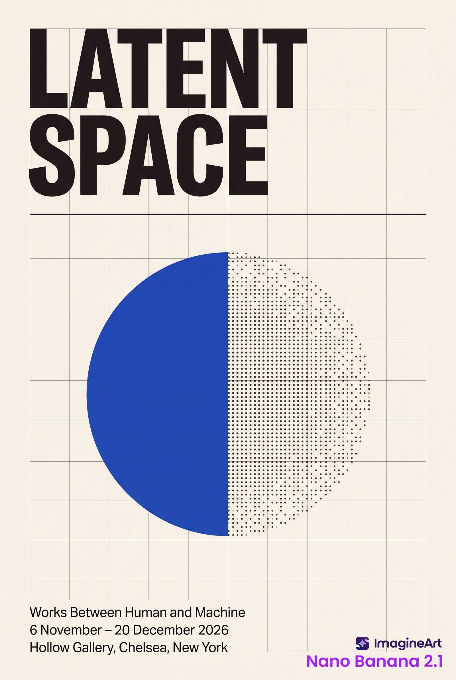
Nano Banana 2.1
- The crispest letterforms of the two, even leading in the information block, and a true cobalt blue.
- Both lines of the title end exactly on grid lines.
- Drew 10 columns instead of 12, and added horizontal rows the prompt didn't ask for.
- Placed the circle's split at the exact center of the page, not off-center to the right.
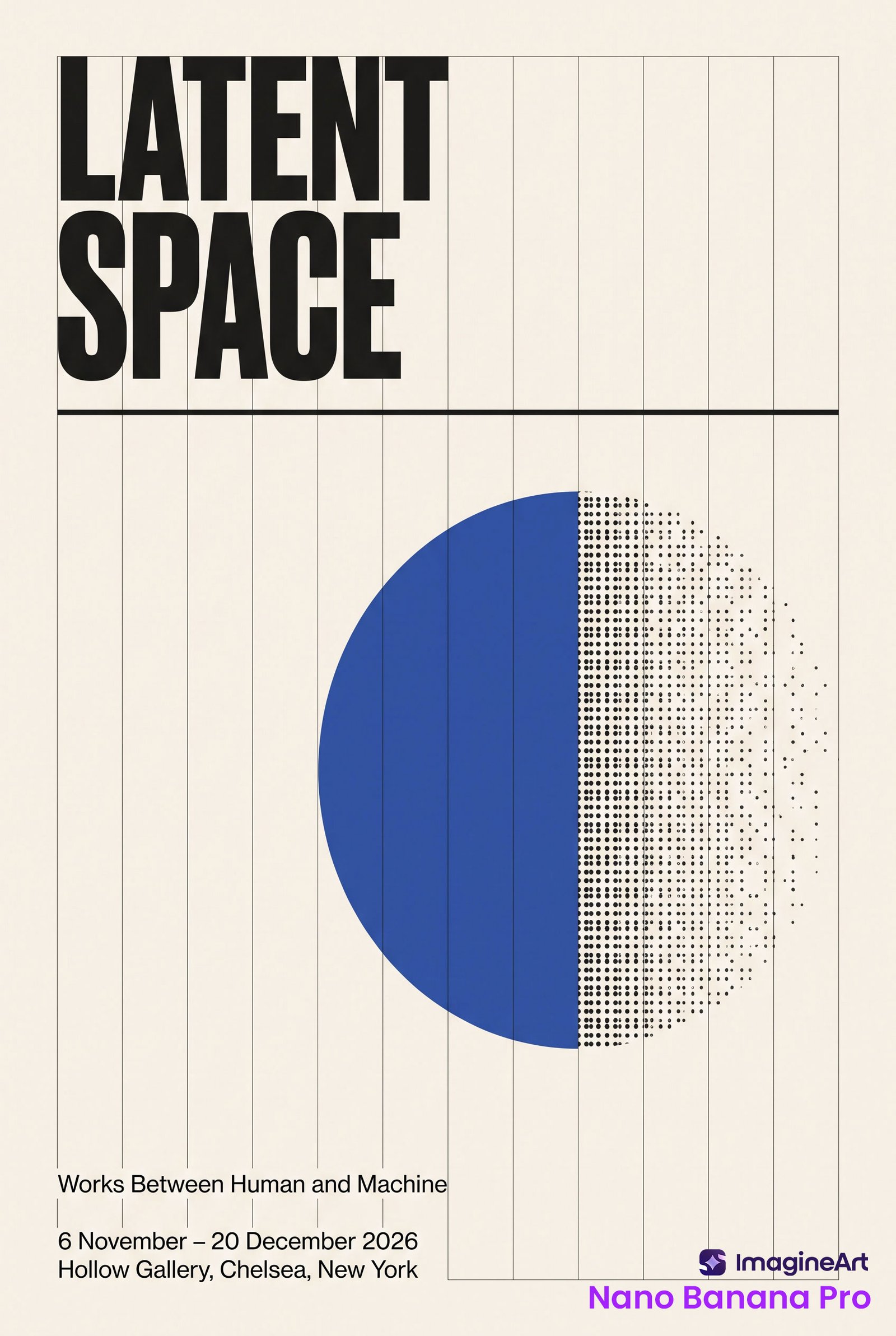
Nano Banana Pro
- Drew exactly 12 columns, vertical only.
- Placed the circle clearly right of center, creating the tension the prompt described.
- The information block has uneven leading: the gap after line 1 is larger than after line 2, with stray grid stubs between the lines.
- Grid lines run over the blue disc, type edges are softer, and the blue drifts toward a muted royal blue.
Both models drew the grid as visible lines. My prompt said "strict 12-column grid" without saying invisible, so that one is on the prompt, not the models.
Test 2A: Subject Consistency (Character Reference Sheet)
On the hardest consistency check, the earring that belongs in one ear only, 2.1 put it in the wrong ear three times. Pro did it once.
Claim tested: leap in subject consistency.
Prompt:
A professional character reference sheet: a 3x3 grid of nine photographic portraits of the same woman, separated by thin white gutters, on a neutral mid-grey seamless studio backdrop. Square 1:1 format.
The woman, identical in every panel: early 30s, East Asian features, short silver-grey bob with a sharp asymmetric fringe sweeping to her left, thin straight eyebrows, a small dark mole just above the right corner of her lip, a single thin gold hoop earring in her left ear only, rectangular tortoiseshell glasses, dark forest-green ribbed turtleneck.
Nine panels, each different: Top row: front view neutral expression; three-quarter view left, slight smile; full profile facing right, serious. Middle row: looking up over her glasses, curious; laughing with eyes half closed; three-quarter view right, glasses pushed up on her head. Bottom row: looking down, contemplative, soft side light; back three-quarter view showing the bob's nape and the earring; close-up, intense direct gaze, hard rim light.
Lighting: soft studio key light in most panels, with the specified variations. Photorealistic, natural skin texture, sharp focus, consistent color grading across all nine panels. No text, no labels, no numbers.
Both models
- Placed the mole on her left instead of her right, consistently across panels.
- Swept the fringe to her right instead of her left, consistently across panels.
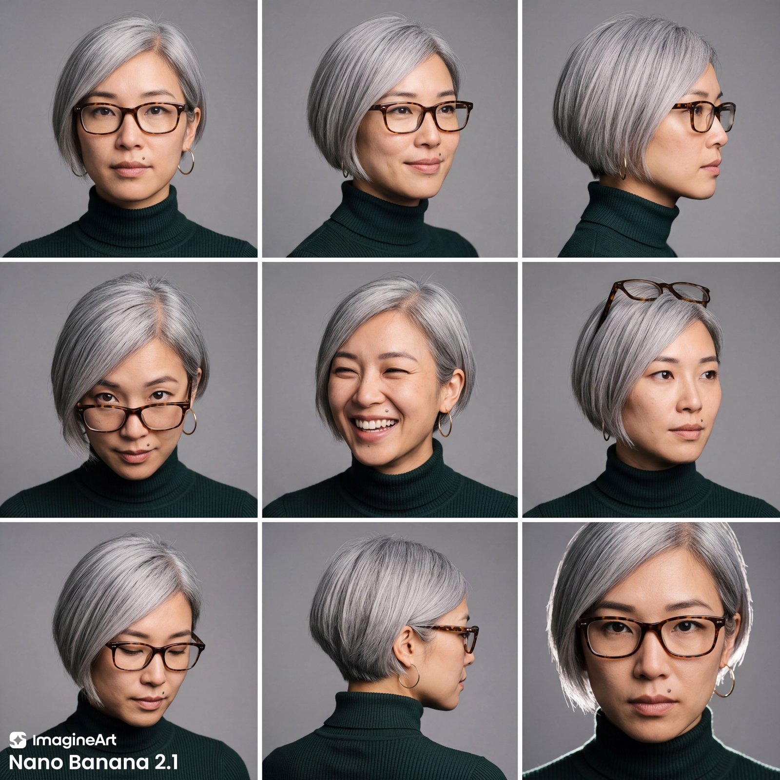
Nano Banana 2.1
- Put the earring in her right ear in panels 2, 3 and 6. Panel 1 also shows a faint second hoop near the left jaw.
- Rendered a true silver-grey across all nine panels.
- Panel 4: slid the glasses down and lifted her eyes above the frames, exactly as asked.
- Removed the glasses in the laughing panel.
- The back view reads closer to a side profile from behind.
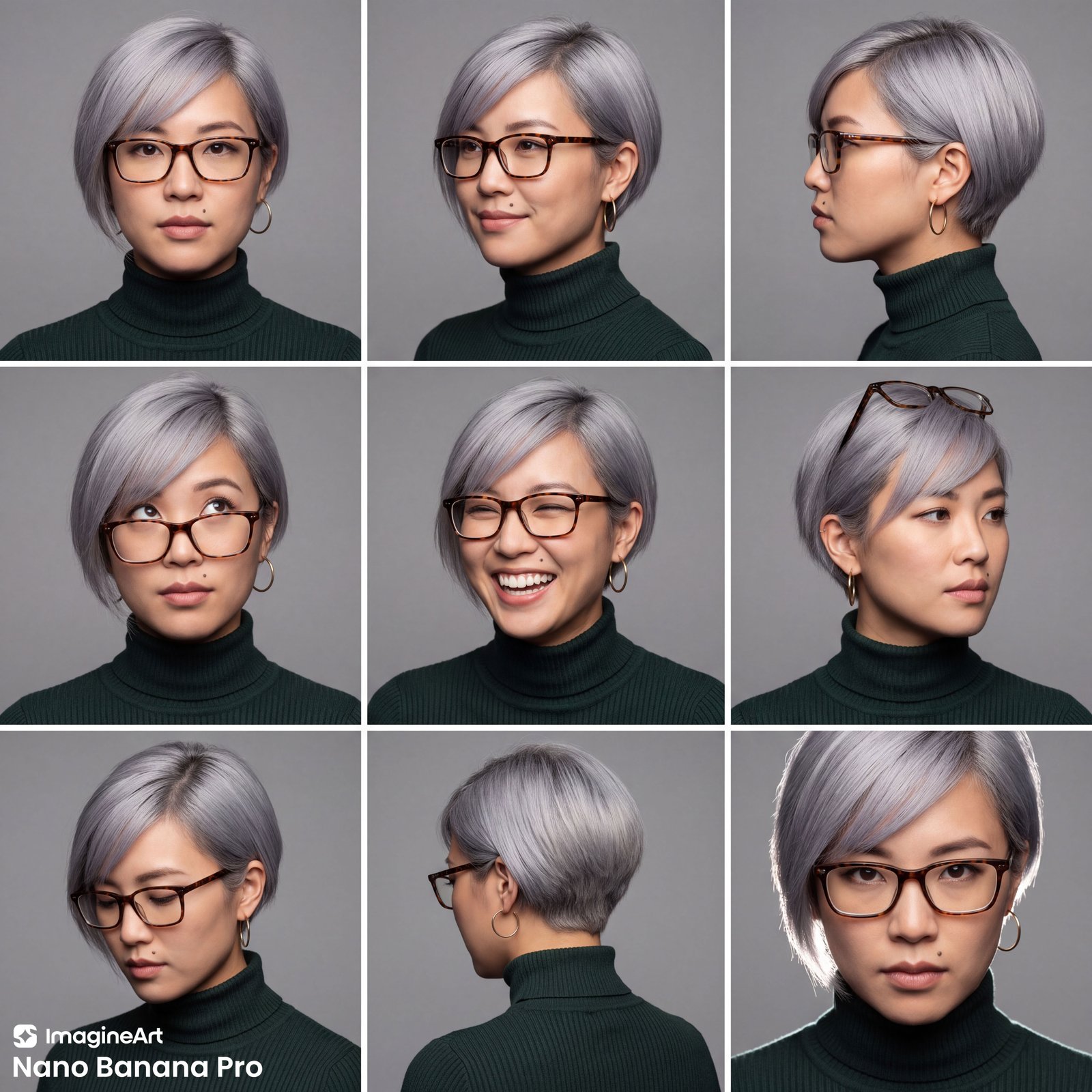
Nano Banana Pro
- Put the earring in the wrong ear in panel 6 only, which also shows a small extra stud.
- The silver drifts toward lavender across all nine panels.
- Panel 4: she looks up through the lenses, not over them.
- Kept the glasses on in the laughing panel.
- Delivered a true back three-quarter view with the nape visible.
- The profile faces left rather than right, but the visible ear stays correct.
Test 2B: Subject Consistency (Four People, Ten Objects)
Neither model put the satchel on the floor. Beyond that, 2.1 got every attribute and count right, while Pro missed two attributes and duplicated an object.
Claim tested: leap in subject consistency.
Prompt:
A photorealistic documentary-style photograph of four adults gathered around a rustic oak worktable in a sunlit craft studio. Landscape 16:9 format, eye-level camera, natural window light from the left.
The four people, from left to right: 1. Far left, standing: an elderly man with a full white beard, red knitted beanie, and faded denim jacket, holding the pair of red scissors. 2. Seated left: a young woman with a long black braid over her right shoulder, wearing a bright yellow raincoat, holding the blue ceramic mug with both hands. 3. Seated right: a middle-aged bald man with round wire-rim glasses and a navy blue cardigan, pointing at the black camera. 4. Far right, standing: a young man with curly copper-red hair and freckles, white t-shirt, leaning on the table with one hand.
Exactly ten objects, each appearing only once: On the table, left to right: a white porcelain teapot, a stack of three hardcover books, a black film camera, an orange, a green glass bottle, a small potted cactus in a terracotta pot, a brass desk lamp. In hands: the red scissors and the blue ceramic mug. On the floor beside the far-right man: a brown leather satchel.
Every person and object clearly visible, no duplicates, no extra people, no extra objects. Natural expressions, as if mid-conversation. Realistic skin, fabric and material textures. No text, no logos.
Both models
- Got the old man, the woman's braid over her right shoulder, the yellow raincoat, and the mug held in both hands.
- Placed the seven table objects in the correct left-to-right order.
- Had the bald man touching the camera rather than pointing at it.
- Had the red-haired man leaning on the table with both hands, not one.
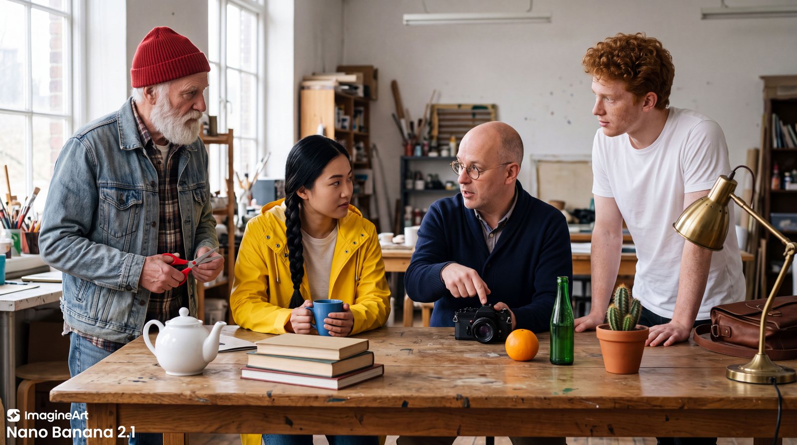
Nano Banana 2.1
- Rendered the round wire-rim glasses exactly as specified.
- Drew three books, as asked.
- Put the satchel on the table instead of on the floor.
- Added a sheet of paper beside the teapot.
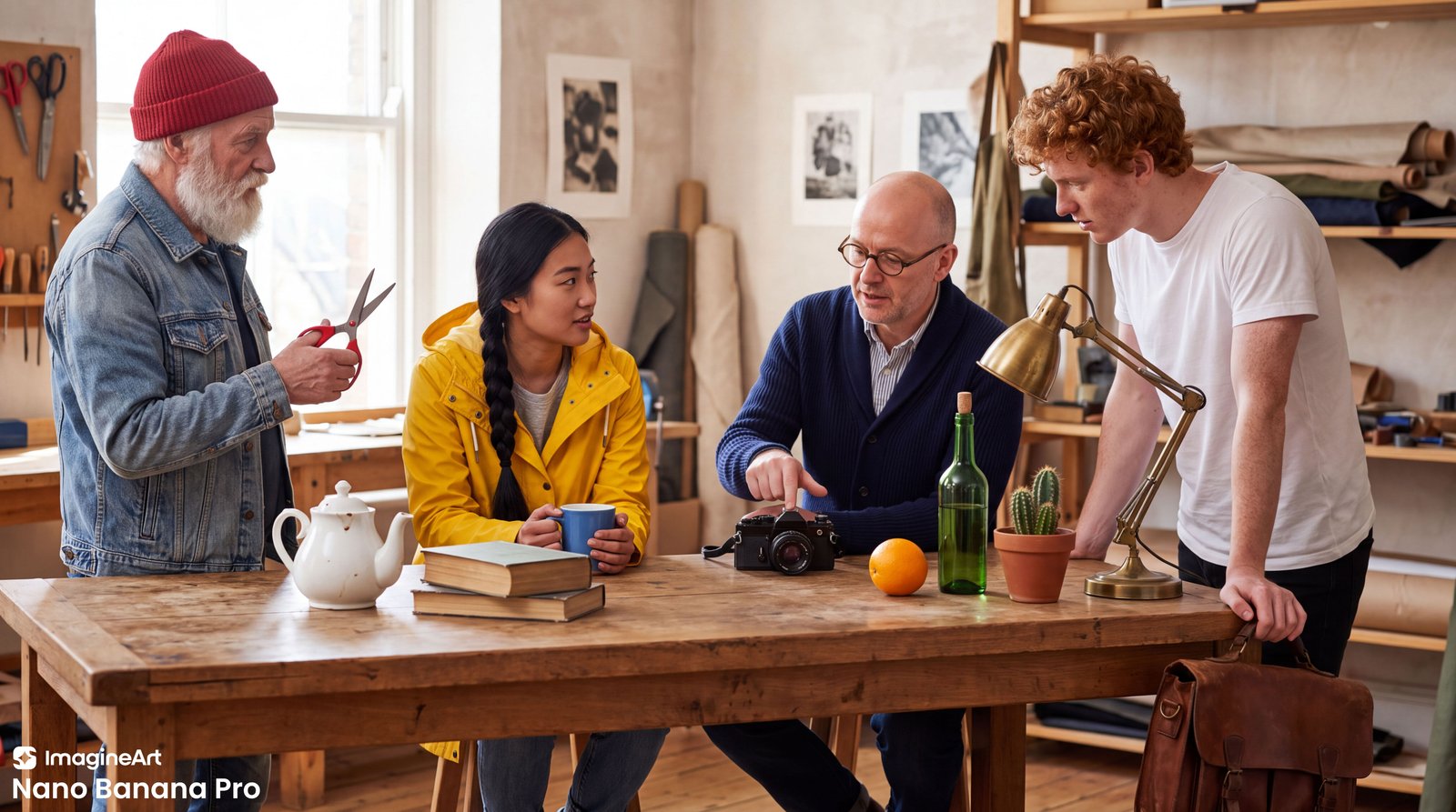
Nano Banana Pro
- Hung the satchel on the right side of the table, held there under the young man's left hand, instead of placing it on the floor.
- Gave the bald man thick acetate frames instead of wire-rim glasses.
- Drew two books instead of three.
- Added more red-handled scissors on the wall pegboard, breaking "each appearing only once" with the very object meant to be unique.
Test 3: Text Rendering (Coffee Tin and Multilingual Card)
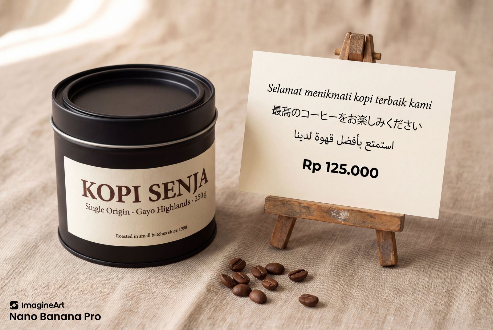
Both models spelled every word correctly, in Latin, Japanese and Arabic. At this difficulty, there was no difference in text accuracy to report.
Claim tested: improved text rendering.
Prompt:
A photorealistic commercial product photograph on a warm beige linen surface, soft diffused daylight from the upper left, shallow depth of field. Landscape 3:2 format.
Left: a matte black cylindrical coffee tin, slightly turned so its label wraps visibly around the curve. The cream paper label reads, in a bold serif typeface: "KOPI SENJA". Below it, in a small sans-serif: "Single Origin · Gayo Highlands · 250 g". At the very bottom of the label, in tiny type: "Roasted in small batches since 1998". All text must follow the curvature of the tin naturally.
Right: a flat cream-colored card standing on a small wooden easel, printed with black text in three centered lines, each in its own script: Line 1, Indonesian: "Selamat menikmati kopi terbaik kami" Line 2, Japanese: "最高のコーヒーをお楽しみください" Line 3, Arabic, right-to-left: "استمتع بأفضل قهوة لدينا" At the bottom of the card, in a small bold sans-serif: "Rp 125.000"
Between them, a few scattered roasted coffee beans on the linen.
Every word spelled exactly as written, with no extra text, no invented characters, no gibberish. Sharp, legible typography with professional kerning and print-quality detail. No logos besides the text specified.
Both models
- Spelled every string exactly as written, including the tiny bottom line of the label.
- Rendered the Japanese correctly, and the Arabic with properly joined letters in right-to-left order.
- Kept the period in "Rp 125.000" instead of changing it to a comma.
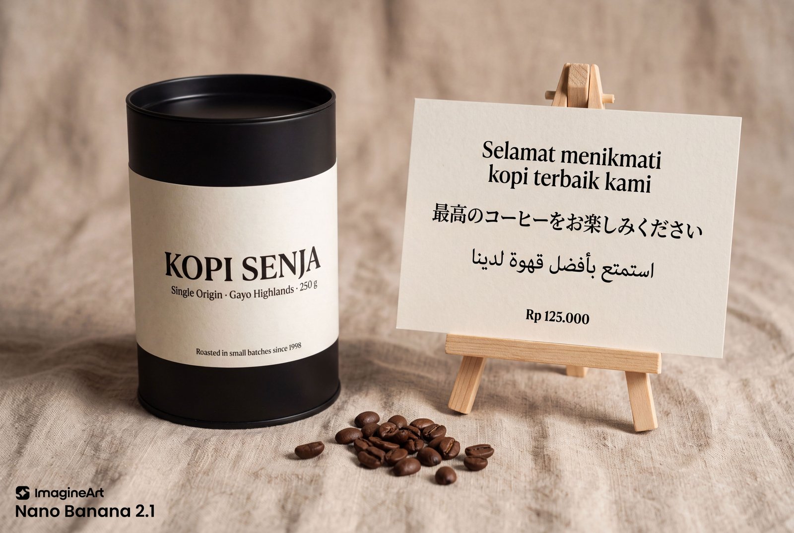
Nano Banana 2.1
- The label reads as a permanent sticker affixed to the cylindrical tin.
- Set the price small, as asked, but in serif instead of sans-serif.
- Split the Indonesian line in two, so the card carries four lines of text instead of three.
- Used one consistent serif family with a calm hierarchy, like real premium packaging.
Nano Banana Pro
- The text compresses toward the tin's edge, the way print on a cylinder actually behaves.
- Set the price in bold sans-serif, as asked, but made it the largest element on the card.
- Mixed an italic serif, a gothic Japanese face and a geometric sans on one small card.
Test 4: Wide Panorama
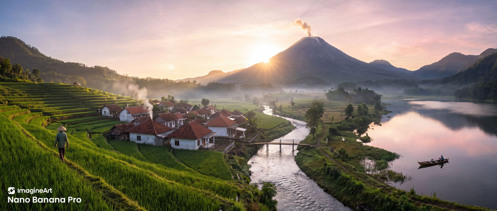
2.1 held a coherent scene across a full 8:1 frame. That capability is real.
Claim tested: wide panoramas.
A format note first. On ImagineArt, 2.1 offers 8:1 but not 21:9, and Pro tops out at 21:9. There was no wide ratio both models share, so I ran each at its widest. That makes this a capability check, not a like-for-like quality comparison: 8:1 is a much harder frame to hold together.
Prompt:
An ultra-wide panoramic landscape photograph of a fictional valley in East Java at sunrise, one continuous scene read from left to right, shot from a high vantage point with a level horizon across the entire frame.
From left to right: Far left: green terraced rice fields stepping down a hillside, a single farmer in a conical bamboo hat walking along a terrace edge. Center-left: a small village of white-walled houses with red clay-tile roofs, thin morning smoke rising from one chimney. Center: a winding silver river crossed by a single wooden footbridge. Center-right: a large solitary volcano with a gentle plume of white smoke, the sun rising just behind its left shoulder, casting golden rim light. Far right: a calm mountain lake reflecting the pink and gold sky, one small wooden fishing boat with one fisherman, near the shore.
Lighting: a single light source, the rising sun behind the volcano. All shadows fall consistently toward the viewer and to the left. Soft low mist in the valley floor.
One continuous landscape, no seams, no repeated or mirrored elements, no duplicated houses, no stitched-panorama distortion. Every zone equally sharp and detailed, including the extreme left and right edges. Photorealistic, natural colors, fine-art landscape photography. No text, no people other than the farmer and the fisherman.
Both models
- Placed all five zones in the correct left-to-right order, with exactly two people.

Nano Banana 2.1 (8:1)
- One chimney plume, one bridge, one volcano, one boat. Nothing duplicated.
- No visible seams. The mist ties the valley together and the far edges stay detailed.
- The river leads the eye to the volcano, so the frame has a focal point instead of reading as a strip.
- The sun sits low beside the volcano's left base rather than behind its shoulder.
- The farmer is lit from the front, although the sun is behind the scene.
Nano Banana Pro (21:9)
- Put the sun exactly behind the volcano's left shoulder, as specified.
- The farmer walks away from the camera, lit from the side, consistent with the sun's position.
- Drew two smoke plumes in the village instead of one.
Test 5: Infographic
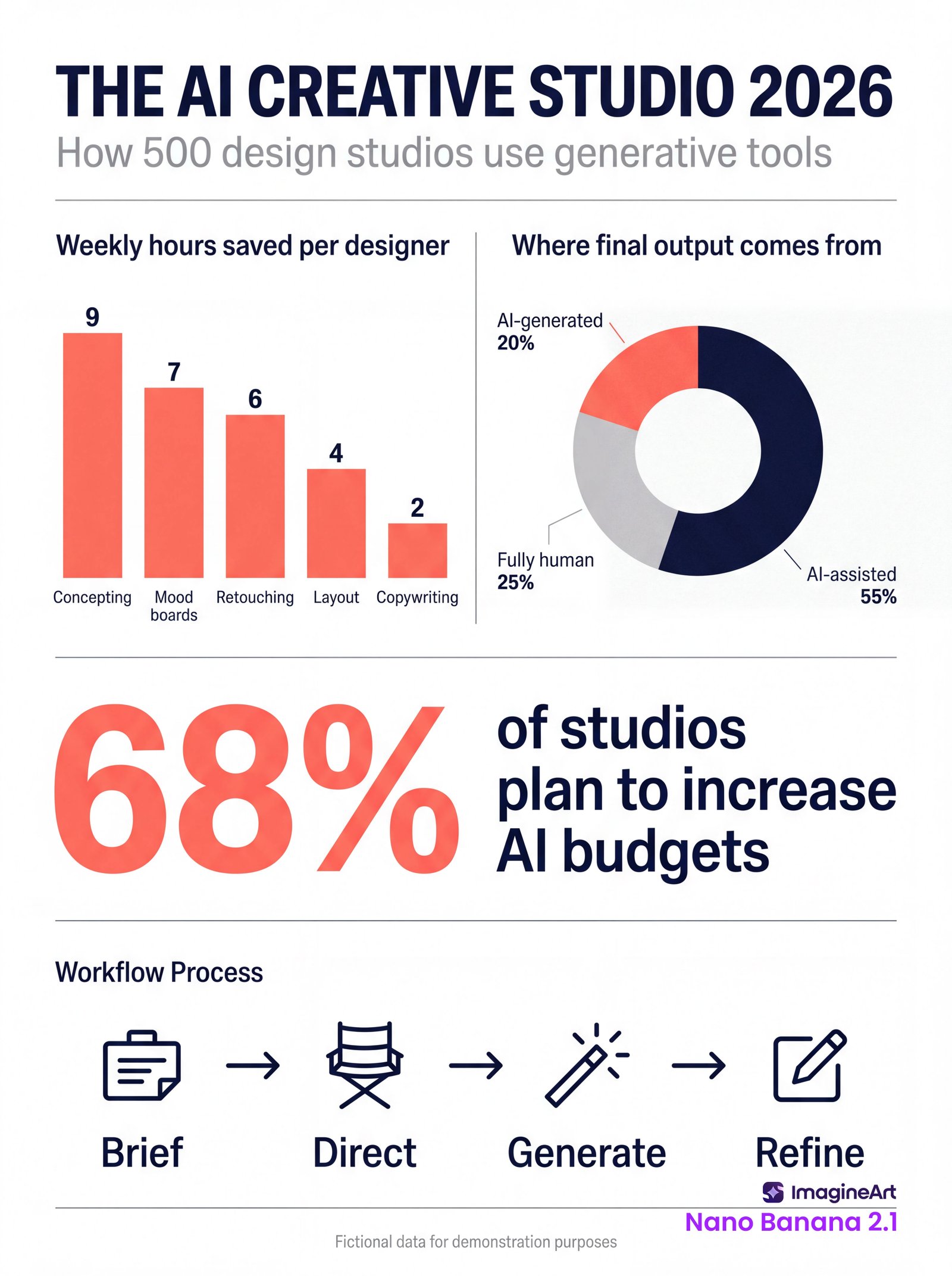
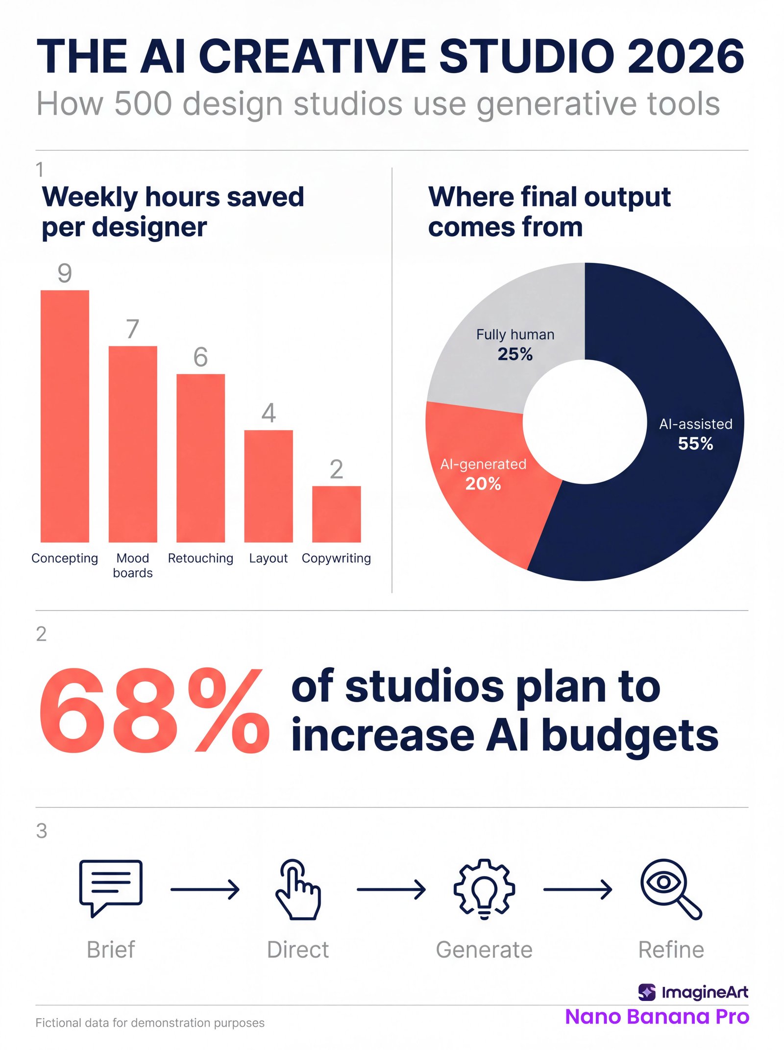
2.1 drew the donut chart with exact proportions and built the clearer hierarchy. This was its strongest result in the series.
Claims tested: infographics, and the leap in visual design. I supplied the data in the prompt, so this tests layout and accuracy, not search-grounded facts.
Prompt:
A clean, modern editorial infographic poster on a white background. Portrait 3:4 format. Palette: deep navy, coral, and light grey only.
Top: the title "THE AI CREATIVE STUDIO 2026" in a bold geometric sans-serif, navy. Subtitle below in smaller grey type: "How 500 design studios use generative tools".
Section 1, left half: a vertical bar chart titled "Weekly hours saved per designer". Five coral bars, heights exactly proportional to their values, each value printed above its bar, category label below: Concepting 9 | Mood boards 7 | Retouching 6 | Layout 4 | Copywriting 2 Section 1, right half: a donut chart titled "Where final output comes from", segment sizes exactly proportional, each with its percentage label: AI-assisted 55% (navy) | Fully human 25% (light grey) | AI-generated 20% (coral)
Section 2: one large callout number "68%" in coral, with the line "of studios plan to increase AI budgets" beside it.
Section 3: a horizontal four-step process timeline with simple line icons and arrows between steps, labeled in order: "Brief", "Direct", "Generate", "Refine".
Bottom footer in tiny grey type: "Fictional data for demonstration purposes".
Strict grid alignment, consistent spacing, clear visual hierarchy, flat vector style, no 3D effects, no photographs, no extra text, no extra numbers, every label spelled exactly as written.
Both models
- Printed every number, percentage, title, label and footer exactly as written.
- Drew the bars in true proportion. In both, the Concepting bar is about 4.5 times the height of Copywriting.
- Kept to three colors and a flat style.
Nano Banana 2.1
- The donut slices measure 55, 25 and 20 percent, exactly as specified.
- Set the bar values in bold navy and made "68%" a genuinely dominant hero.
- Chose a director's chair for "Direct", a magic wand for "Generate" and a pencil for "Refine".
- Added a "Workflow Process" heading the prompt didn't ask for.
Nano Banana Pro
- The donut slices measure roughly 56, 23 and 21 percent. The grey slice is visibly short of a quarter.
- Placed the donut labels inside the segments, which reads cleanly.
- Set the bar values and timeline labels in light grey, which weakens the hierarchy.
- Added the section numbers 1, 2 and 3, despite "no extra numbers". My prompt did use "Section 1" wording, though 2.1 got the same prompt and didn't add them.
- Used a magnifying glass for "Refine", which reads more as "review".
Test 6: Photorealism (No-Makeup Beauty Portrait with Diamonds)
The result split cleanly: 2.1 made the better photograph, Pro made the better diamonds.
Claim tested: improved visual quality.
Prompt:
A photorealistic close-up beauty portrait of a stunning American female fashion model in her late 20s, framed from the top of her head to just below the collarbones, facing the camera with a calm, direct gaze. Portrait 4:5 format.
Completely bare face, no makeup at all: no foundation, no mascara, no eyeliner, no lipstick, no contour, no highlighter. Natural, uneven skin tone, visible pores, faint freckles across the nose, fine peach fuzz catching the light, natural untinted lips, bare lashes, unshaped natural eyebrows with individual hairs. Shoulder-length dark brown hair tucked behind both ears, hazel eyes. Bare shoulders.
Jewelry, exactly as described: Earrings: a single round brilliant-cut diamond stud in each ear, set in four-prong platinum settings, both clearly visible. Necklace: a fine platinum chain with one pear-shaped diamond pendant, point facing down, resting just below the hollow of the throat.
The diamonds show real optical behavior: crisp facets, bright white sparkle, and small flashes of rainbow fire. No glitter, no glowing blobs, no extra stones.
Lighting: one large soft key light from the front-left, plus a small hard accent light from above right to make the diamonds sparkle. Seamless warm grey background.
Camera: 100mm macro lens at f/4, eye-level, tack-sharp focus on the eyes and the stud earrings. Unretouched editorial beauty photography, no skin smoothing, no airbrushing, no glossy AI sheen.
Both models
- Delivered a genuinely bare face: no mascara, no lip tint, no filled brows. Pores, freckles and uneven tone are all there.
- Hung the pendant at mid-chest rather than just below the hollow of the throat.
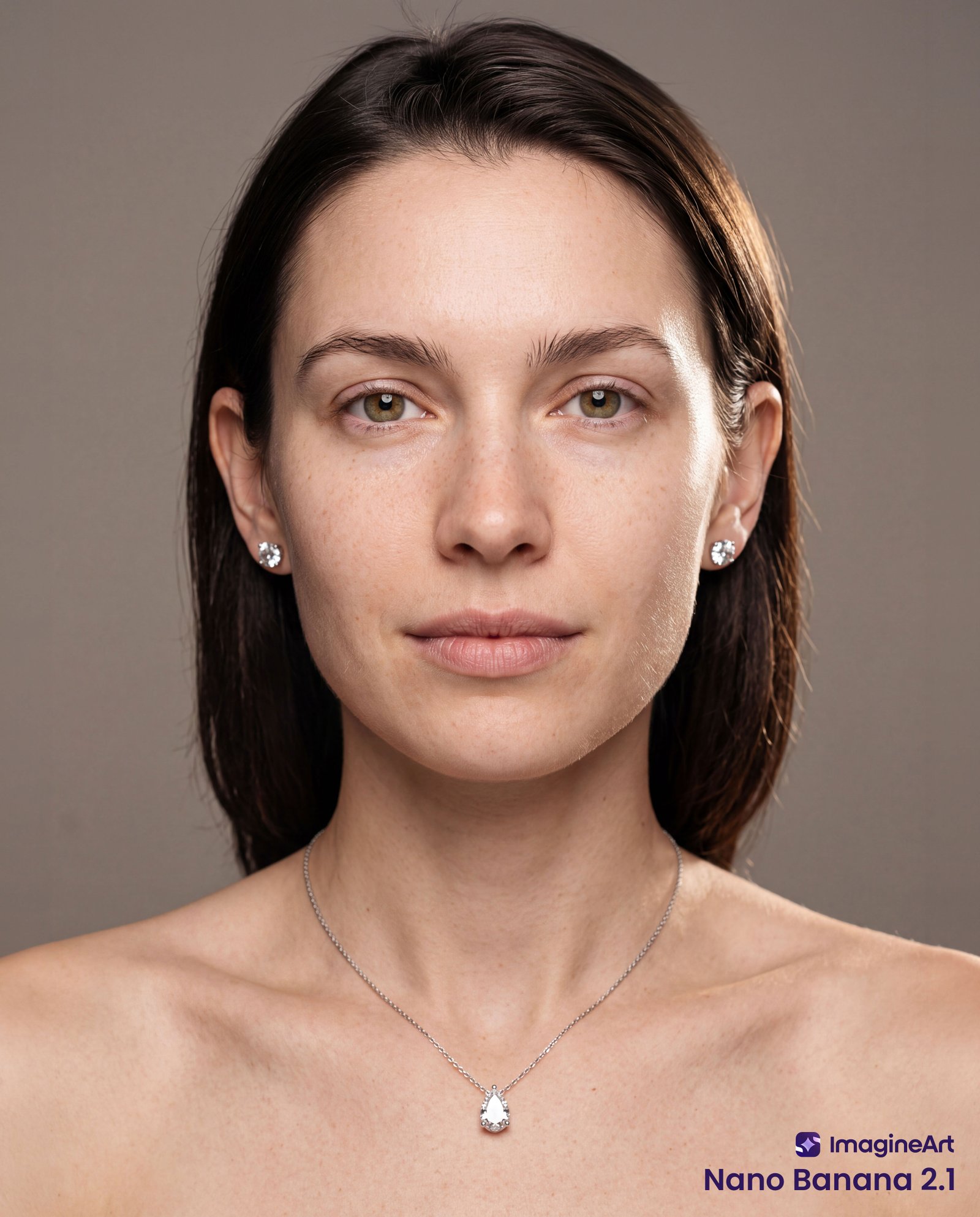
Nano Banana 2.1
- Peach fuzz catches the light along the jaw and temple, the hardest skin detail in the prompt.
- The lighting has real dimension. It reads as an editorial beauty photograph.
- The pendant looks milky and opaque, with no visible facets.
- Surrounded the pendant with a halo of small stones, despite "no extra stones".
- The studs look glassy, with no visible rainbow fire.
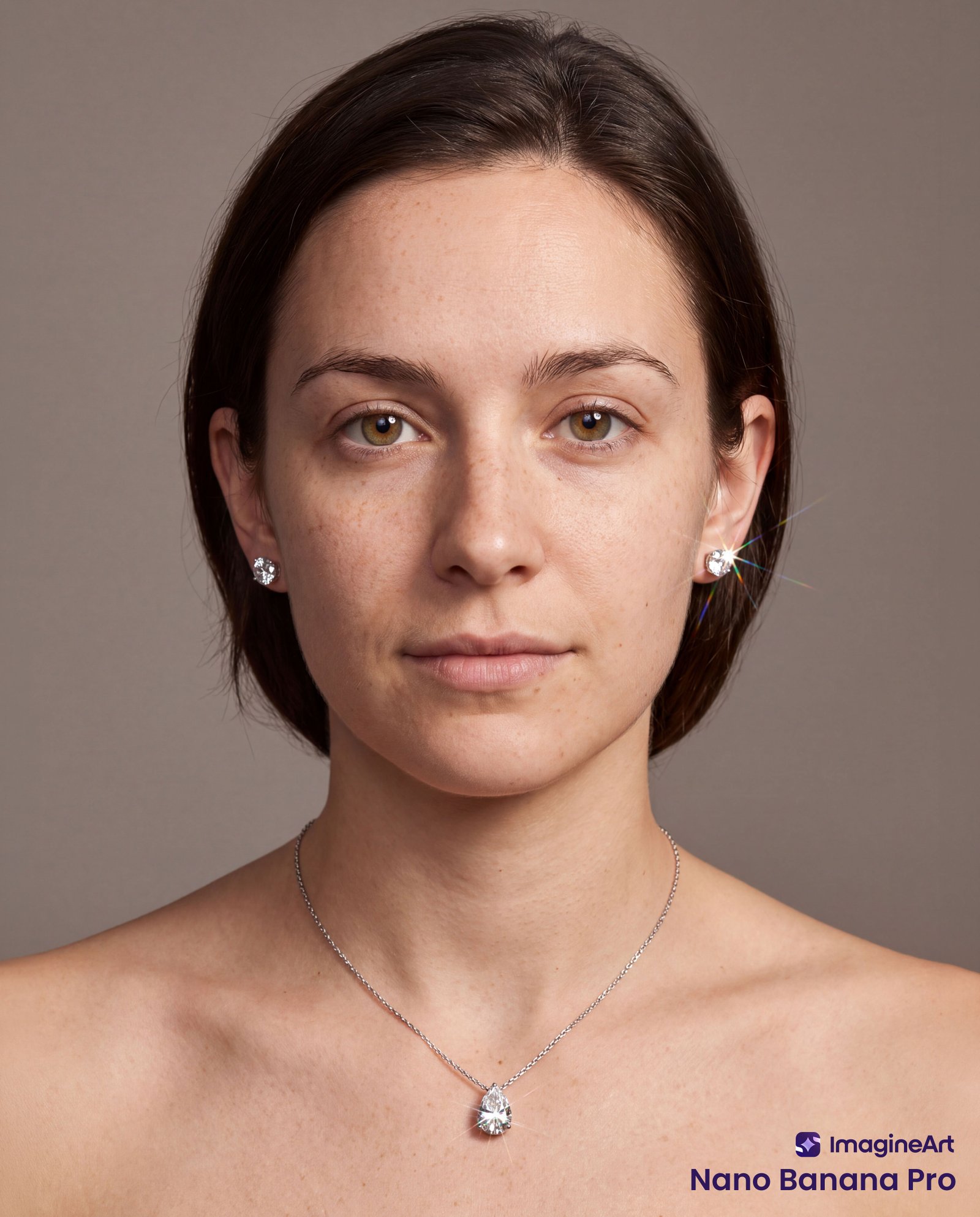
Nano Banana Pro
- The pear-shaped solitaire has crisp facets, a prong at the tip, the point facing down, and no halo.
- The studs show four prongs and visible flashes of rainbow color.
- One stud carries a large star-shaped flare with rainbow rays that reads like an added filter effect.
- The lighting is flat and even, closer to a passport photo than editorial beauty work.
- The hair is chin-length rather than shoulder-length.
What This Test Can't Tell You
These findings describe seven single generations, across six use cases, on one platform. They are facts about what I saw, not a benchmark.
- Baseline. Google's "improvement" claims are made relative to Nano Banana 2, which retires on October 29, 2026. This report doesn't test improvement over Nano Banana 2, only how 2.1 stands against Pro.
- Sample size. One generation per model, per test. A different seed could produce different errors.
- Platform. ImagineArt's default settings, with no access to 2.1's thinking levels. Results elsewhere may differ.
- Formats. Test 1 ran at 2K, the rest at 4K. Test 4 compared 8:1 with 21:9.
- Two contained ambiguities that both models had to interpret: the visible grid in Test 1 and the section numbering in Test 5.
- Untested features. Mask-based editing, multi-turn conversation and search grounding were outside a generation-only test.
What I'd Tell Another Fellow Creators
If your work is structured graphics, 2.1 delivered what Google claims. Infographics, data charts, typographic layouts and extreme wide formats were where it was strongest in my tests.
If your work depends on precise physical detail, check every output. Which ear an earring sits in and how a diamond's facets catch the light were details 2.1 got wrong where Pro got them right. Both models also misplaced the satchel in the four-person scene.
A launch claim tells you where to look. It doesn't tell you what you'll find. All fourteen images are above. Look at them, judge them yourself, and tell me where you see it differently.