AI Image Models Never Stop Evolving. So, Have You Tried Qwen Image 3.0 Pro?
Every few weeks there's a new "state of the art" image model. After 30 years in design and advertising, I've learned to ignore the marketing copy and just test the claims myself.
So when Alibaba's Qwen team dropped Qwen Image 3.0 Pro, I designed three specific tests — one for each pillar of their own pitch — and ran them through LMArena's side-by-side generation mode, which gave me direct access to the actual qwen-image-3.0-pro model (still rolling out unevenly elsewhere — more on that below). Here's what I found.
What Is Qwen Image 3.0 Pro?
Qwen Image 3.0 Pro is the third-generation image generation model from Alibaba's Qwen team (Tongyi Qianwen), served through Alibaba Cloud. It was announced on July 21, 2026, initially in invite-only preview, and reached full general availability on August 5, 2026 — opened up to every user on the Qwen Studio platform (chat.qwen.ai).
Access and pricing: Qwen Studio's free tier gives you the image tool with usage limits, no cost. On the API side, third-party resellers (OpenRouter, AIHubMix, Kie.ai) list it around $0.03–0.04 per 1K-resolution image and up to $0.075 for 2K. Some gateways briefly ran it free during a limited promotional window. Notably, it hasn't rolled out everywhere yet — as of this writing, NightCafe gates it behind a Pro subscription, ImagineArt, InVideo, and PixVerse don't carry it at all, and even Qwen's own chat.qwen.ai defaulted my account to the older 2.0 model. The most reliable route I found was LMArena, which hosts the actual qwen-image-3.0-pro model directly and let me generate side-by-side without any subscription gate — that's the platform behind every test result below.
What actually changed from 2.0: This is the real story. Qwen's own framing sums up each generation with a single word: 1.0 was "Precision" (准), 2.0 was "Precision, Variety, Completeness, Beauty, Authenticity" (准多齐美真), and 3.0 is simply "Real" (实). Behind the slogan, three concrete upgrades:
- Prompt budget exploded — from roughly 1,000 tokens in 2.0 to approximately 4,500 tokens in 3.0. That's the difference between describing one subject and describing an entire dense layout — sections, labels, hierarchy, multiple languages — in a single instruction.
- Small text rendering — Qwen claims legible text down to approximately 10 pixels, aimed squarely at the failure point every image model has quietly struggled with.
- One notable step backward: unlike 1.0 and 2.0, which both shipped with open Apache 2.0 weights and same-day technical reports, 3.0 launched closed — no weights, no benchmark table, no architecture disclosure. If you need to self-host or fine-tune, this generation isn't for you.
Qwen frames its pitch around three pillars: Rich Content (dense layouts), Deep Knowledge (realistic interface/world simulation), and Authentic Details (photorealistic texture). I built one test per pillar.
Test 1: Rich Content — A Dense Bilingual Infographic
I asked Qwen to generate a 5-panel horizontal timeline infographic charting its own model history — title, five distinct sections, each with a date header, model name, a Chinese-character keyword with pinyin and English translation, three bullet points, and a matching icon.
The Prompt
A wide horizontal infographic banner titled 'QWEN-IMAGE: EVOLUTION OF AN AI MODEL' in bold modern sans-serif at the top, dark navy background with subtle circuit-pattern texture. Below the title, five equal vertical panels arranged left to right, connected by a glowing horizontal timeline arrow running through the middle of all panels, each panel separated by thin light-blue divider lines.
Panel 1 (leftmost): Header 'AUG 2025' in small caps, below it the model name 'Qwen-Image 1.0' in bold white text, below that the Chinese character '准' large and stylized in gold, with pinyin 'Zhǔn' and English translation '(Precision)' in smaller italic text beneath it. Below, three short bullet lines in clean sans-serif: '20B MMDiT Architecture' / 'Apache 2.0 Open Weights' / 'Native CJK + Latin Text'. Small icon of an open padlock above the bullets.
Panel 2: Header 'DEC 2025', model name 'Qwen-Image-2512', subtitle 'Photorealism Upgrade' in gold accent text. Three bullets: 'Natural Texture Fidelity' / 'Enhanced Human Depiction' / '#1 Open-Source on AI Arena'. Small icon of a camera aperture above the bullets.
Panel 3: Header 'FEB 2026', model name 'Qwen-Image-2.0', below it five Chinese characters '准多齐美真' in gold, with English translation '(Precision, Variety, Completeness, Beauty, Authenticity)' in small italic text wrapping beneath. Three bullets: '7B Lighter Architecture' / 'Native 2K Resolution' / '1,000-Token Prompts'. Small icon of a resolution/grid symbol above the bullets.
Panel 4: Header 'JUL 2026', model name 'Qwen-Image-3.0', below it the single Chinese character '实' large and stylized in gold, with pinyin 'Shí' and English translation '(Real)' beneath. Three bullets: '4.5K-Token Prompts' / '10px Text Rendering' / 'Closed Weights, No Benchmarks'. Small icon of a magnifying glass above the bullets.
Panel 5 (rightmost): Header 'AUG 2026', model name 'Qwen-Image-3.0 Pro' in the largest, boldest text of all panels with a subtle gold glow effect signifying the current flagship. Three bullets: 'General Availability' / '12 Languages, 20+ Fonts' / 'Dense Layout Mastery'. Small icon of a rocket launch above the bullets.
Overall style: clean corporate tech-editorial infographic, consistent typography hierarchy across all panels, gold and white accent colors on dark navy, sharp readable small text throughout, high resolution, flat design with subtle depth shadows, 16:9 aspect ratio, no photographic elements, no logos, no watermarks.
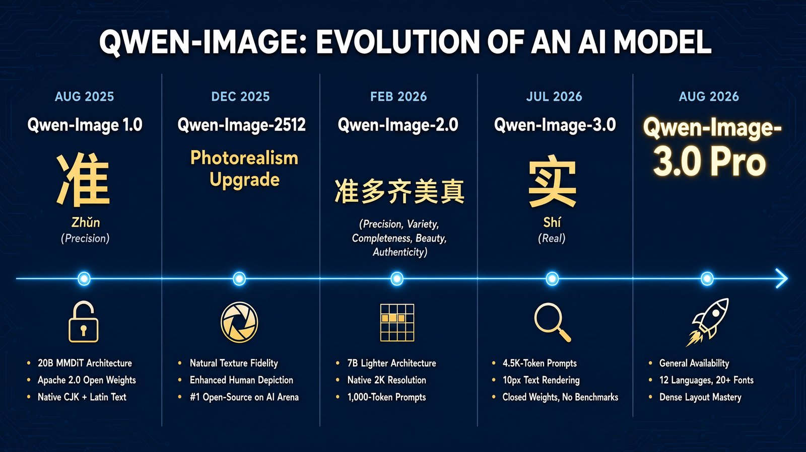
Result: Delivered. All five panels held their structure without collapsing into a single merged mess. Every date, model name, and bullet point matched the brief exactly. The Chinese characters — including a five-character string — rendered cleanly with correct strokes and matching pinyin. Across roughly 60+ words of small caption text and 7 CJK characters, I couldn't find a single corrupted glyph.
This is the test that matters most for anyone doing infographic, presentation, or dense-layout client work. The 4.5K-token prompt claim held up under real pressure.
Test 2: Deep Knowledge — A Four-Layer Nested Interface
This one was designed to be unfair: a professional video editing software interface, showing a program monitor with a phone held in-frame, the phone's screen displaying a live-streaming shopping UI (viewer count, chat feed, product card), and inside that livestream, the streamer holding up a printed magazine with an editorial headline.
The Prompt
A wide desktop screenshot showing a video editing software interface (similar to a professional NLE like Premiere or CapCut Pro), dark grey UI with a timeline at the bottom showing video clips, and a large preview monitor panel in the center-right of the screen. Inside that preview monitor, the video being edited shows a smartphone mockup held in a hand, and the smartphone's screen displays a live-streaming shopping app interface — visible elements include a viewer count counter reading '2,481 watching' in the top corner, a red 'LIVE' badge, a scrolling comment feed on the left side with three short visible chat messages, and a product card at the bottom showing a price tag reading '$24.99' with an 'Add to Cart' button. Inside that smartphone's live-stream video feed itself, the streamer is shown holding up a printed magazine, and the magazine's visible page displays a small fashion editorial spread with a headline reading 'AUTUMN COLLECTION' in bold serif type and a smaller byline underneath reading 'Style Notes, Issue 12'.
Each layer must remain clearly a screen-within-a-screen: crisp bezels or frame edges separating the desktop editing software, the smartphone device outline, and the magazine page edges, so a viewer can trace exactly which layer is nested inside which. Maintain consistent lighting logic — the outer desktop scene lit by soft office lighting, the smartphone screen self-illuminated and slightly brighter, the magazine page under the smartphone's on-screen lighting. All text at every nested layer must remain sharp and legible, including the small viewer count, chat messages, price tag, and magazine headline. Clean modern tech-editorial style, high resolution, 16:9 aspect ratio, no watermarks, no logos of real brands.
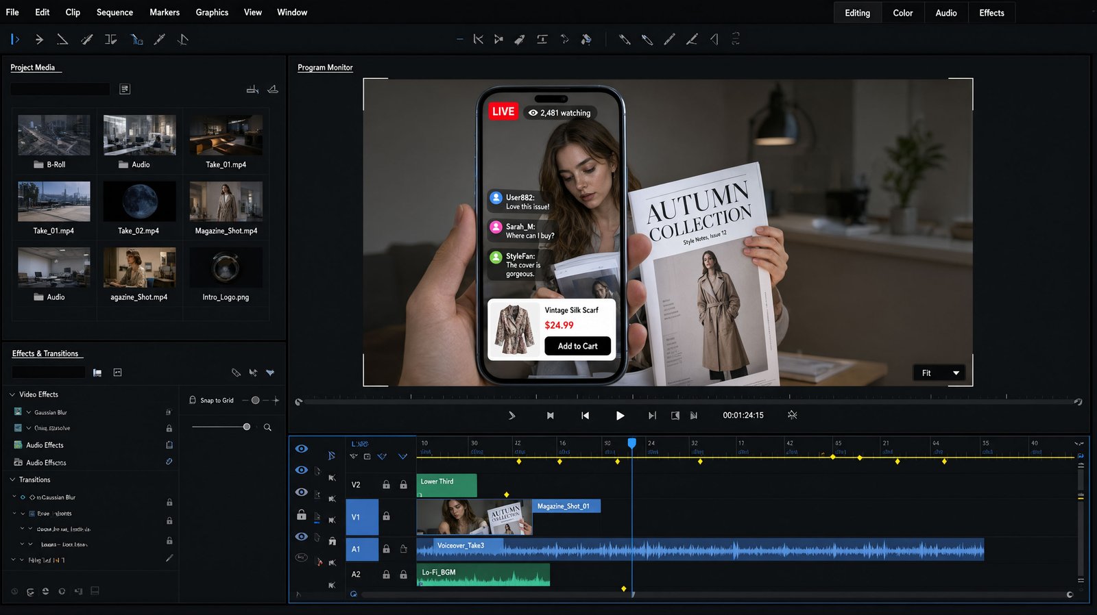
Result: Mostly delivered, one flaw. All four nested layers stayed visually distinct and coherent — NLE software chrome, phone bezel, livestream overlay conventions, and print typography each read as genuinely different interface types, not a generic screen repeated four times. Every line of small text landed correctly: the viewer count, three separate chat messages, the price tag, and the magazine headline all matched the brief word-for-word.
The one miss: the product card labeled an item "Vintage Silk Scarf" while the thumbnail image showed a trench coat. A text-image semantic mismatch — small, but exactly the kind of detail that would need a manual fix before client delivery.
Test 3: Authentic Details — Skin, Hair, Fabric, and a Gemstone
The hardest test. A tight close-up beauty portrait, demanding four textures simultaneously: visible skin pores, individually rendered eyebrow hairs and baby hairs, a woven linen fabric with visible weave, and a faceted blue gemstone earring catching directional light.
The Prompt
A tightly cropped beauty photography portrait, framed from the forehead to the chin, filling most of the frame. A young woman in her mid-20s with healthy, natural skin texture: visible fine pores across the nose, cheeks, and forehead, a soft natural sheen rather than flat smoothness, and subtle natural skin variation rather than artificial perfection. Her eyebrows are full and well-groomed, with individual hair strands visible and naturally textured. A few loose hair strands frame her hairline, each strand rendered individually and catching the light. Her eyes are deep brown, clear and bright, with fine natural texture in the iris, individually separated eyelashes, and natural moisture reflection. Her lips have a soft natural rose tone with visible fine texture and subtle natural sheen.
She wears a cream-colored linen headscarf draped loosely to one side, the fabric showing a visible tight woven pattern and soft natural folds. A small blue gemstone stud earring is visible near her ear, its facets catching the light with sharp reflections and a subtle cool blue sparkle against her warm skin tone.
Lighting: soft directional window light from the left side, creating natural shadow falloff along the cheekbone and jaw to reveal skin texture. Background is a plain, softly out-of-focus warm beige wall. Photographed with a 100mm macro lens at f/4, sharp focus on the eyes and skin detail, natural color grading, unretouched documentary-style realism, high resolution, 4:5 aspect ratio.
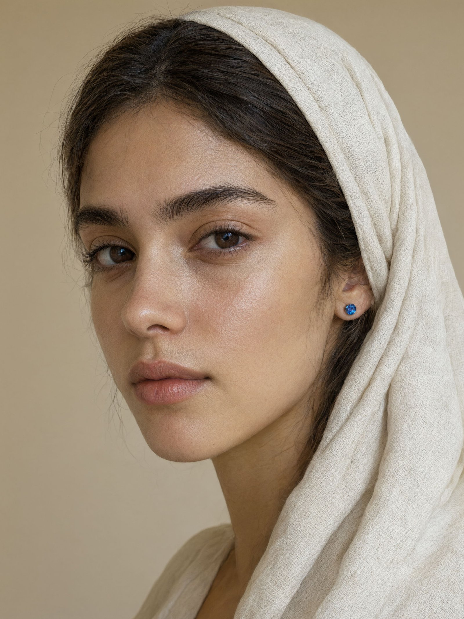
Result: Strong pass across all four — but only visible on closer inspection. Skin showed genuine pore-level texture and natural variation rather than airbrushed smoothness. Eyebrows and baby hairs were individually distinguishable, not painted-on. The linen fabric showed real woven texture and natural fold shadows.
At normal viewing size, the gemstone earring is easy to underestimate — small details like facet structure simply don't register at a glance. That's why this test is worth doing properly: zoom into the earring at 300% in an image editor like Photoshop, and a different picture emerges. Distinct lighter and darker facet-like patches, small bright specular highlight points, and a visible dome/cut shape all become clear. It's not razor-sharp diamond-cut precision — a real diamond would show harder, more angular light breaks — but it's a genuine rendered attempt at faceted structure, not a flat shortcut.
My takeaway: don't judge fine detail at thumbnail size. Qwen 3.0 Pro appears to be rendering real micro-detail even where it isn't obvious at a glance — worth zooming in before calling a texture "flat."
Final Thoughts
All three of Qwen's core promises held up under genuinely demanding, specifically-designed tests: dense multilingual layouts with small text, multi-layer nested interface simulation, and authentic photorealistic detail across both organic textures and a faceted reflective object.
That's a rare thing in this industry: a model whose marketing claims survived contact with a skeptical practitioner. The trade-off is real too — closed weights, no benchmarks, and access that's still rolling out unevenly across platforms.
For my own workflow, this earns a real place in the toolkit — for dense infographic and layout work, UI/mockup concepting, and now portrait-level detail work too, provided you're willing to zoom in and verify before judging the output.
Over To You
Would you add Qwen Image 3.0 Pro to your stack?
If yes — what's the use case pulling you in: the dense-layout capability, the multilingual rendering, or something else entirely?
If no — is it the closed-weights model, the uneven platform access, or a capability gap you've hit that I haven't?
Drop your take below. I'll be running more field tests as access widens.